
The website “Our world in data” specializes in gathering data, assessing it, and presenting it effectively through graphs. Looking purely at numbers and trying to distill a trend or message from them is often quite difficult. I think this website does an effective job of presenting important world data in an interesting manner. The specific article I found the graph on is titled “CO2 and other Greenhouse Gas Emissions,” by Hannah Ritchie and Max Roser. They elaborate on the role CO2 plays in our atmosphere (its processes and interactions with plants and humans) and give close to 30 graphs that show various statistics. Levels of methane, nitrous oxide, are shown, along with representations of various GHG outputs by country. All the graphs are interactive, and you are able to click on them to learn more.
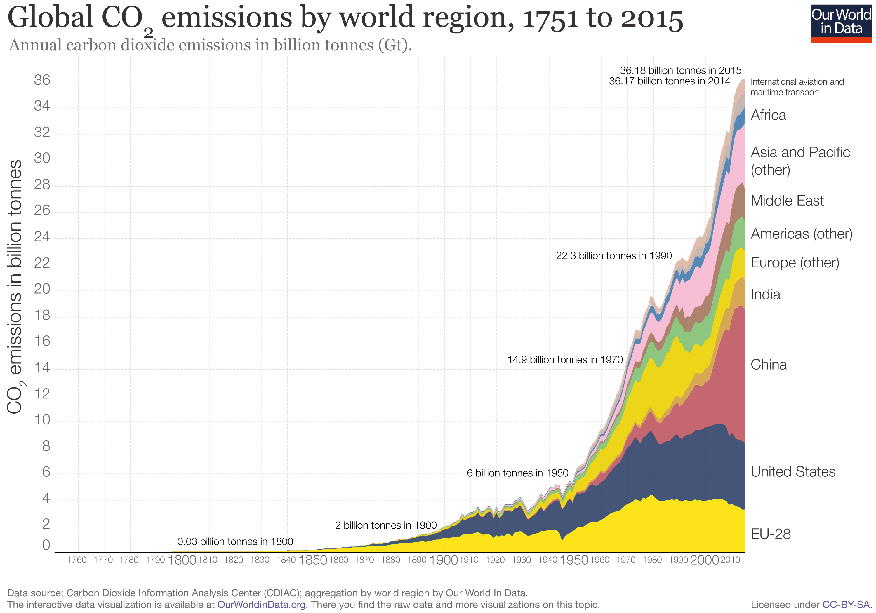
The graph I chose to present deals with the global CO2 levels worldwide in recent history. A line graph of sorts, it breaks down global CO2 emissions, but distinguishes each countries output by color. The graph starts in the year 1751, so its interesting to see how little CO2 was emitted early on compared to now. Industrialization and the rise of the world’s population are obviously the largest factors in play here with this trend. However, even from 1990 to 2015, there was a significant jump, where CO2 emissions almost doubled. In looking at the division of countries by color, one can see that the U.S. and China make up the bulk of world emissions. China has slightly larger emissions than the U.S. currently. I think it’s interesting to see that no other singular country comes close to the U.S. or China in terms of emissions.

You brought up another type of graph unlike any other that we’ve previously talked about in class: interactive graphs. These types of graphs help us to visualize and personalize numbers through an interactive means.
I do find it interesting as well that no other country comes close to China or the U.S’s CO2 emission rates. Like you said, industrialization of the new world led ultimately to increased levels of CO2 in our atmosphere. I am also interested in learning more about what specifically has contributed to the substantial rise in our CO2 emissions, since 1990.
I think it would be really interesting to look at what percentage of CHina’s emissions are reduced producing and exporting goods to the United States, and then with that measurement what would that mean for the United States. I think as one of the main contributors to emissions the United States should do more instead of attempting to dismantle the EPA or removing our name from the COP21 agreement. All in all this post and graph are unsurprising. How do you think we can approach an issue like this?
I liked your use of an interactive graph. I think interactive graphs enable people to understand more fully the issue or data being presented. At the same time, the issue you raise is also interesting. I think its important to note that while countries like China, and up until a few years ago the U.S., are trying to reduce their carbon footprint and emissions, developing countries trying to catch up to the rest of the world still emit without regard for the environment. What will this graph look like in 20 years? I’m guessing some of the biggest emissions culprits will be different.
I think you did a great job of explaining a graph that looks complicated at first glance. Sometimes, figures such as this one seem intimidating and hard to tackle so it is important to note that if you break down the data, interpreting it becomes more manageable. I like how you explained that CO2 emissions are rising everywhere, but there are individual differences between countries.