High School Dropout Rates by Family Income 1972-2001

According to Radical Math, the graph below shows high school drop out rates of students aged 15 to 24 by family income from 1972-2001 for grades 10-12 in the United States. This study was produced by the United States Department of Commerce. Low Income is categorized as an income in the bottom 20% of all family incomes, middle income is categorized as a income between 20% and 80% of all family incomes, and a high income is categorized in the the top 20% of family incomes.

This graph shows that within families of lower income there are higher drop out rates compared to families with middle and low incomes. In 1972, the drop out rates among low income families was 14.1% while the drop out rate was 2.5% for high income families. In 2001, the drop out rate for low income families was 10% which decreased from 1972. In 2001, for high income families the drop out rate was 1.7%. According to this article by American Psychological Association (APA), the United States is currently in a drop out crisis. Their data in 2012 shows that 1.1 million students in the graduating class did not receive a high school diploma. Their reasoning for this is the adverse toxic stressors that are put on these students ultimately affecting their behavior and health. There is a need for solutions to improve the high school drop out rates.

Poverty Among Families in the U.S.

According to the U.S Census Bureau, of the 308,745,538 people living in the United States in 2010, 12.3% were living below the poverty line. The graph below shows the percent of people living under the poverty line among single family homes and married couple families with kids under the ages of 5 and 18. Overall, there is a greater percentage of families with a single mother living in poverty than families with married couples.


Among families with a female householder, 45% with kids under 5 years old and 39.7% with kids under 18 years old are below the poverty line. Among married couple families, 6.3% with kids under 5 years old and 7.9% with kids under 18 years old are living below the poverty line. The percent difference between each household type is very large, but I am not surprised that more single parent households are below the poverty line because they only have one income to support the family. Additionally, I imagine that there are more single mothers with kids under the age of 5 living below the poverty line because they need to financially support their family while also providing childcare for their young kids. There are fewer married couple families living below the poverty threshold because it is possible that there are 2 incomes that support the family.


Green gentrification in Brooklyn

Brooklyn is one of the five boroughs located in New York City and it is recognized as a global city, a green city, and a gentrifying city.  It is a global city because there are 2.5 million residents and one-third of its residents were born outside of the U.S.  Brooklyn has becoming self-consciously “green” in the twenty first century with a number of recent high-profile LEED certified buildings, new bike routes, and ambitious greenways are highlighted, as well as the high ratings local elected officials receive from environmental advocacy groups.  Kenneth A. Gould and Tammy L. Lewis, authors of “Green Gentrification: Urban Sustainability and the Struggle for Environmental Justice”, argue that this increased “greening” occurring in Brooklyn is leading to a jump in the city’s gentrification rate.  Much of the city’s growth is due to internal migration meaning Americans are flocking to Brooklyn and foreign immigrants are being forced out of the city they’ve lived in for decades.  “Green gentrification” is defined as the appropriation of the economic values of an environmental resource by one class from another (Gould & Lewis, 25).  This means that as environmental resources in Brooklyn become more available as amenities, that area of Brooklyn becomes more attractive to the wealthy, white in-migrants of the U.S.

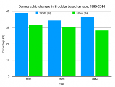
I took data provided in Gould & Lewis’s book that was focused on Brooklyn as a whole, as opposed to a single neighborhood, and graphed the increase of the white population compared to the decrease of the black population from 1990 to 2014.

As the graph shows, the green bar represents the black percentage in Brooklyn which has been gradually decreasing as the blue bar, which represents the white percentage in Brooklyn, has stayed steadily higher from 1990 to 2014.  Gould and Lewis argue that this is a result of green gentrification and environmental injustice in Brooklyn because wealthier, white residents are attracted to the quality of environmental amenities and push out low-income, black residents in the process.