Wage gap between immigrants and U.S.-born citizens

Immigration has been an increasingly covered issue in the media in the last few years. Many americans fear that immigrants are “taking the jobs from american-born citizens.” However, this article in Forbes shows the wage-gap between US-born and immigrant americans. The discrepancies in pay between these two groups is in the thousands in over 29 states. This graph below shows the ten states with the highest wage-gap differences between immigrants and US-born citizens.

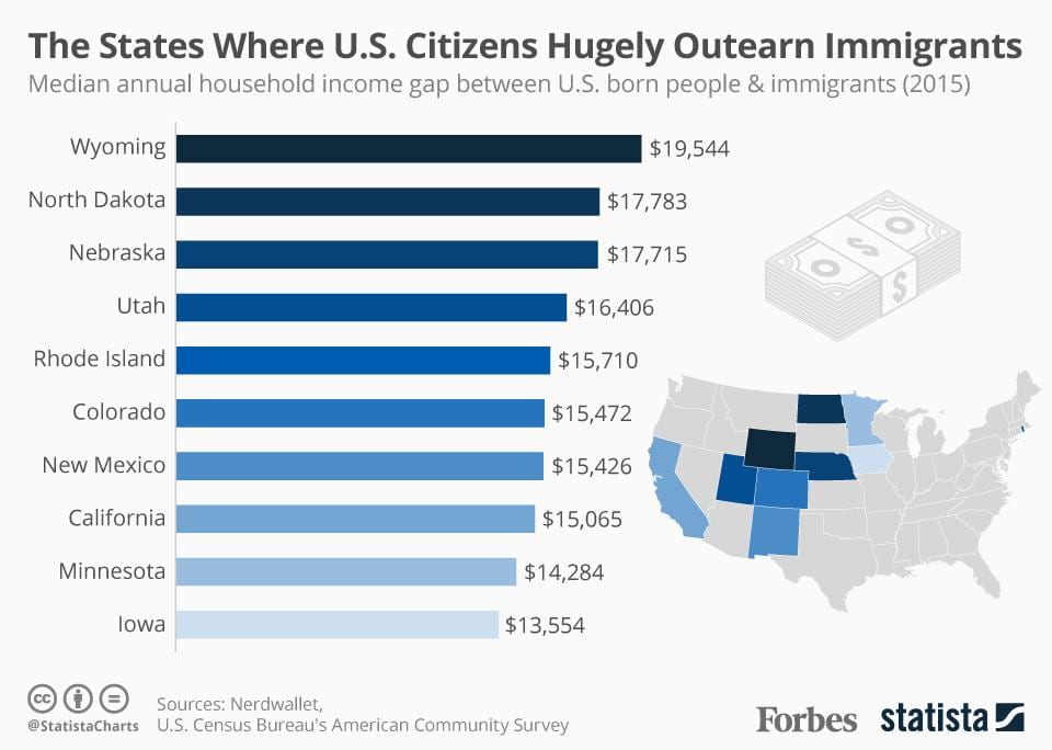
According to this graph, the top of the list is an almost $20,000 difference in the annual income of these two groups. The US-born citizens had a median annual income of $59,689 while the immigrants earned $40,145. The article also mentions that immigrants make less money than U.S.-born citizens in 45 states. So although some americans may fear that immigrants are taking opportunities from U.S.-born citizens, this data shows that U.S.-born citizens are, at the end of the day,  making more money annually than immigrants.


Comparing the Wages of Females Compared to Males

This graph was based off of information I found in an article regarding the wage gap and just how apparent it is in our world today. There is an obvious great deal of issues when it comes to gender roles, as there is more and more discussion regarding women’s rights. Finally, people are beginning to question why men are treated in such high regard when women are still managing to be given the lower hand.

The world is well aware of the fact that for some reason, men earn more money than women when comparing annual incomes. However, I feel as though it is less talked about how this is even more so the case when it comes to women of color. As shown in the graph attached, Hispanic women earn just over 50% of what White men earn when comparing their average annual incomes. This compares to Asian women, that earn almost 90% of what men earn when comparing their average annual incomes.

This baffles me, as I was already alarmed when I fist learned how little white women earn compared to men. When I found out the statistics regarding other races, I saw the gender gap as that much more severe. 

Poverty Rates

Image result for poverty rates 1990 to present

I found this graph to be very interesting. Illustrating the poverty rate in the United States since 1990, there seems to have been a few high points and low points that correlate with various economic depressions or surpluses. As much as these numbers may spike and drop significantly, the poverty rate in the United States never deviates greater than 4% in the last 28 years. In addition, it should be noted that the lowest and highest levels of poverty existed in 2000  and 1993. Following the surplus left by President Bill Clinton, the country saw a dip in unemployment down to 11.3% percent. After a steady rise following 9/11 however, the unemployment rate sky rockets to just over 15% when the economic recession of 2008 hits. For most of President Barack Obama’s second term, these numbers remained pretty consistent. From the end of 2014, to present day our poverty rate nationwide has been dropping pretty consistently and at quicker margins. I would like to point out however, that these graph only focuses on the overall poverty statistics. As it is, the U.S. Census Bureau states that African Americans make up over 20% of impoverished people throughout the United States. So despite these poverty rates decreasing overall, I would be interested to see a more thorough break down of poverty rates by demographic as well as races within that demographic, in order to see if these graphs and statistics are truly accurate and not misleading.

Graduation Rates

I gathered this data on Graduation Rates from United States Public Schools by race from Education Weekly. 

As you can see, graduation rates differ greatly between races. Students who identified as Asian or Pacific Islander had a 91% graduation rate, the highest out of all races. On the other hand, students who identified as American Indian or Alaska Native had a 72% graduation rate, the lowest out of all races and almost 20% lower than Asian/Pacific Islander. The chart also tells us that students who were English-Learners had a graduation rate of 67%, while students with disabilities had a graduation rate of only 66%.

I believe that this chart shows us that there are some issues with our education system. The low graduation rates for English Learners and Students with Disabilities tells us that schools should be dedicating more resources to these demographics. Students learning English or students with learning disabilities often face challenges that students without disabilities who speak English already do not face. In order to overcome these challenges and succeed, more educational resources need to be allocated in these areas.

The correlation between race/wealth & higher education

In my AP Gov class I took a few years ago, we did extensive research on the correlation between wealth and race and higher education. We studied if what your race and annual income was had an effect on your level of education. My classmates and I found that there was in fact a direct correlation between the two things, and I have found a few charts to help visualize it.

It comes as no surprise that the higher salary one makes, the further along they’re going to go in their schooling. Compare an upperclass, white family in New England to a lower class, African American family in Baltimore. There is a much higher chance that the children in New England are going to receive a high level of education. And what’s the correlation? There are many factors that play into these outcomes, but the more financially stable a home is, the more time they have to focus on getting their kids to school, and the better areas they can live in with better school systems. A lot of the time, lower income families do not have the drive to send their children to school because they have too many other financial responsibilities to worry about, or they just do not live in an area with effective school systems/schools at all.

I watched a documentary called “Step” that follows a few girls throughout high school in Baltimore. Though the children may have had the motivation to do well in school, some of them weren’t being pushed or supported by their families because they didn’t have the time or money. Going to school should be a human right, but unfortunately, at least today, it is a privilege. Not enough kids have access to higher education, let alone education at all.


what do Americans think about racism?

I came across data from the Pew Research Center that has polled Americans over the last 20 years asking wether they think racism is a problem or not. The data is broken down further when presented in graphs in order to track the differences in answers over the past couples decades.

As you can see more people believe racism is a big problem today than they did 20 years ago. I thought this was interesting so I looked into some of the data further and saw graphs that compared these views with two other variables, wether the person was democrat or republican and wether they were white or black.

It is clear that both the whites and blacks that think racism is a big problem has increased over the past years. The republicans and Democrats also have seen this problem increasing. But, the democrats have exponentially increased the percentage of people who think racism is a big problem over the last few years while the republicans stayed at roughly the same percent.

Prison demographics over time

I chose to create two graphs that illustrate the growing prison population from 1990 to 2014. The issue of mass incarceration is extremely prevalent at the moment. One of the institutions of the United States which begs for significant reform is the criminal justice system. With the US being the countries with the most prisoners per capita, it is clear that efforts need to be made to reduce these numbers. I created the following graph depicting the overall rise in the prison population. You can see that the number of total inmates rises somewhat steadily from 1990 to about 2007 and then begins to level off approaching 2014. While it is positive that the population has stopped rising so quickly, it is important to make efforts towards decreasing the number of people in prison more rapidly as well.

The following graph depicts the rise in the prison population by the offense. This graph depicts drug offenses a the most common and fastest growing reason that people go to prison. While property offenses, violent offenses, and other seem to have remained consistent over time, drug offenses as well a public order defenses have clearly risen. I am not surprised by what is shown about drug offenses due to the recent movement to decriminalize more minor drug offenses. This seems like it could be an effective way to decrease the overall prison population because drug offenses make up the greatest portion of prisoners in the system.

Drugs and People

Drugs are a valuable commodity and have a positive or negative  effect in the lives of individuals, based on their use and perception about drugs. We live in a world were drugs are addicts living homeless and are placed in lower social standings because of their drug problems, while patients use drugs in the same breath but in a controlled environment. In courts drugs related cases are treated differently based on the population in consumption of the particular drug. People of lower economic social status use crack in higher numbers because it is cheaper and easier access, compared drugs people of middle and upper class use like cocaine. But are given less time imprison because of the effects of the social constructions surrounding these two drugs. The social construction that places people of color down are multifaceted, for it is on education, economy, medicine, and the judicial system. This not only creates data that is biased, it creates false imagery of a group of people that internalize those ideologies believing it’s how they are meant to behave.

The sentencing of people in courts are biased based on the completion of their skin not even based in race with is also a social construct. Scientist proved that we are all 99.99% identical disregarding our origins, the concept of race was created to place people in social groups of different standings because of the human obsession of categorization and control. This system always places people of color lower on the spectrum often with support from science and political powers that impact people on a daily basis that people fail to recognize. There were more than 1.5 million drug arrests in the U.S. in 2016. The vast majority – more than 80% – were for possession only. People of color experience discrimination at every stage of the judicial system and are more likely to be stopped, searched, arrested, convicted, harshly sentenced. Research shows that prosecutors are twice as likely to pursue a mandatory minimum sentence for black people as for white people charged with the same offense. Among people who received a mandatory minimum sentence in 2011, 38% were Latino and 31% were black, while they are the minorities in the population as a whole.


http://www.drugpolicy.org/resource/drug-war-mass-incarceration-and-race-englishspanish