Sustainable Fishing

When it comes to the fishing industry there are a lot of issues of sustainability. Whether it is in the catch size, techniques used, areas fished in, or bycatch. Bycatch is the accidental catching of the not target species. In most cases, these marine life forms are often killed before they can be released back into the ocean. Bycatch poses another major issue within the already difficult overfishing problem.

This graph is based on data from the FOA regarding catch sizes between the years 1950 and 2018. This graph shows the growth trend of the fishing industry and as more sustainable attitudes developed a slower decrease in catch size in the more recent years. The lowest catch was in 1950 with about 250,000, the highest being in 2002 with catch sizes around 850,000. The size eventually drops down to about 680,000 in 2018. Based on this larger drop in 2018 and information from the NOAA and FOA this number aims to be lowered even more. Protecting marine populations will increase the likelihood that these populations can survive and repopulate in order to sustain future generations.

.https://www.fao.org/fishery/en/collection/capture

https://www.fisheries.noaa.gov/bulletin/noaa-fisheries-announces-changes-catch-levels-sector-allocations-accountability

Gas Prices By State

One relevant topic to sustainability is the carbon emissions from vehicles into our atmosphere. Recently there has been a United States increase in prices of gas and this can be beneficial for our future. Electric cars are becoming more practical with the ridiculously high gas prices. In the graph below, there are ten different states in the U.S. and their current price per gallon. As we can see, the different states have different prices which can be confusing to people wondering why it isn’t unanimous throughout all states. The data was collected from triple A where they collect data on gas prices daily. As we can see from the graph, California has the highest price per gallon and Texas has the lowest price per gallon. It would be interesting to find a correlation between the gas prices per state and the reason as to why they are all close, but different.


https://gasprices.aaa.com/state-gas-price-averages/

Greenhouse Gas Emissions Globally

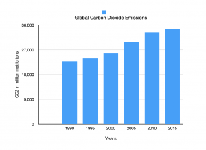
Climate change and the long term effects that come with it is something that most people agree is an issue that needs to be combated.  The global temperature increase is mainly caused by human activities, which produce gasses that trap heat in our atmosphere.  These greenhouse gasses have increased from human activity, and, as seen by my graphs below, are still increasing, furthering climate change.  When most people think of a greenhouse gas, they think of carbon dioxide being emitted into the atmosphere.  As seen below, between 1990 and 2015, the net emissions of carbon dioxide increased by 51% globally.  This is a real issue, as three-fourths of total global emissions come from carbon dioxide, so it is a major contributor to global warming.  Carbon dioxide was not the only greenhouse gas that has increased globally; as seen below, methane increased as well.  Methane was actually the gas in the data set that increased the least, only 17%, but as you can see from the graph, even the gas that increased the least still consistently increased in recent years.  Other gasses that are not pictured in the graphs but increased include nitrous oxide and fluorinated gasses.  No matter how you look at it, the way these greenhouse gasses have consistently increased globally is a sign we need to make real changes to combat this issue before it gets even more out of hand.

CO2 Emissions Per Capita Per State

The graph I created is one that shows the annual CO2 emissions per capita per U.S. State with data up until 2017.

(I couldn’t get the chart to upload with better quality for some reason, so please use this link instead to view it as a PDF)

In metric tonnes, this data helps to show the amount of CO2 emissions produced per state per person. When looking at this graph, it is very easy to see where the high amounts of CO2 emissions per capita are found: states like Wyoming, North Dakota, and Alaska stand out as the worst offenders for CO2 emissions per capita. This is in contrast to states like New York, California, Oregon, and Maryland who comparatively have very small CO2 emissions per capita.

This could lead people to believe that states like Wyoming, North Dakota, Alaska, etc. are more responsible for the large CO2 emissions put out annually by the U.S. as opposed to states like New York, California, etc., but that would be incorrect. What this chart tells us instead is that states on this chart that appear to be putting out gargantuan amounts of CO2 are instead putting out large amounts of CO2 in comparison to their population. A state like Wyoming that has a relatively small population but large amounts of farming/agriculture could appear to produce extreme amounts of CO2 compared to a state like New York, when in reality New York could be putting out much more CO2, but due to its large population it doesn’t appear to be as extreme of a CO2 emitter as Wyoming.


WORKS CITED

https://www.eia.gov/environment/emissions/state/analysis/

Food Waste management in the U.S.

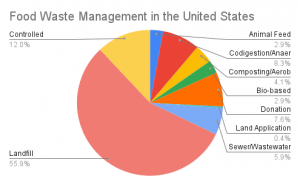
Food waste is a massive problem in the United States.  Currently, a large portion of food is wasted in the United States and this wasted food ends up in various places.  These charts document the pathways in where wasted food ends up after it goes unused in 2018.  The column chart on the left depicts the weight in US tons of wasted food and approximately how many tons of wasted food end up in each place.  As you can see, the largest number of wasted food ends up in landfills with 35,277,543 tons of wasted food managed by landfills.  This massive number dwarfs any other pathway for wasted food.  For instance, wasted food used on land application is only 259,448.  The amount of wasted food that ends up in landfills is 135.97 times greater than the amount of wasted food used for land application.  The pie chart on the left details the same numbers however this chart gives the percentages of where wasted food ends up. As you can see more clearly, all other pathways for wasted food combined are less than the percentage of wasted food that goes to landfills.  In 2018, 55.9% of all wasted food was sent to landfills and not used in any other constructive way.  Out of the 63,132,123 tons of food wasted in 2018, 35,277,543 tons of that food ended up in landfills.  Not only is it horribly unsustainable to waste  food, but the methods in which wasted food is used afterwards is even more unsustainable and is contributing to the problems that we are seeing today.

Works Cited:

https://www.epa.gov/facts-and-figures-about-materials-waste-and-recycling/food-material-specific-data#:~:text=The%20estimated%2035.3%20million%20tons,percent%20of%20all%20MSW%20landfilled.

Recycling and composting trends (1960-2018)

I complied a bar graph that showed the percentage increase in the number of different materials that was increased from 1960 on. This shows that through the years the amount of things recycled has increased along with having more things being able to be recycled. This could be caused by the increase in education and the advancements in technology.

1960 1970 1980 1990 2000 2005 2010 2015 2017 2018
Paper and Paperboard 17% 15% 21% 28% 43% 50% 63% 67% 66% 68%
Glass 2% 1% 5% 20% 23% 21% 27% 28% 25% 25%
Plastics Neg. Neg. <1% 2% 6% 6% 8% 9% 9% 9%
Yard Trimmings Neg. Neg. Neg. 12% 52% 62% 58% 61% 69% 63%
Lead-acid Batteries Neg. 76% 70% 97% 93% 96% 99% 99% 99% 99%

Data from the United States Environmental Protection Agency.  National Overview: Facts and Figures on Materials, Wastes, and Recycling.


(sorry if the image is blurry- my laptop was being difficult)

Single Use Plastic Bottles per Week

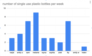
Single use plastic water bottles are very bad for the environment, typically because they are not recycled and are often thrown out. The plastic takes centuries to full decay and as plastic decays it leaks dangerous chemicals into the groundwater and soil. Even if plastic is recycled, it might not be recycled properly and would still need to decay on the earth. The total carbon footprint of one plastic water bottle is about 828 grams of carbon dioxide. Lots of college students use single use plastic bottles for water, coffee or any other drink. These cups are typically thrown away, adding to the amount of plastic waste in the world. This chart shows that the average number of single use plastic bottles per week is 3.9 amongst the sample size that I gathered data from. The lowest number per week was 0, due to my friend’s constant usage of a reusable water bottle and the highest number was 9. That means per week a college aged student similar to my friends would use 3.9 single use bottles adding up to a 3229.2 grams of carbon dioxide per week released due to this plastic waste.

sources: https://www.greenamerica.org/blog/truth-about-bottled-water


CO2 Emissions by Country

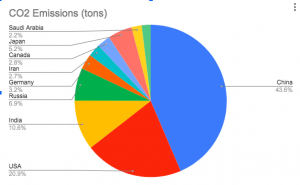
Of course we know now that emissions of carbon dioxide are incredibly harmful to our earth and the ozone. As one of the most prominent and dangerous green house gasses, limiting carbon dioxide emissions is crucial to saving our planet before it heats up to a point of no return. The graph that I am going to conduct is relatively simple but it will be stats on some of the largest and most industrialized countries in the world and the numbers that relate to their C02 emissions.


These ten countries make up nearly 70% of the worlds CO2 emissions and of these 10 countries, China make sup 43.6% of the emissions. These countries are all very industrialized and have shown large jumps in population growth. If that growth continues, some policies have to implemented to lower these emissions!

Shower Length and Water Waste

An issue that directly connects to sustainability is water waste. The way I aim to measure water waste in daily life is through how long it takes my friends to shower. Showering is one of the easiest ways to waste large quantities of water because of the constantly flowing stream of water. I asked many of my friends how long on average that they shower for in order to evaluate how much water they waste. Based on their answers and the data I gathered, my friends spend on average 21.8 minutes in the shower. The shortest time recorded is 5 minutes and the longest time is on average 45 minutes. The average flow rate of a shower head is 2.1 gallons per minute. This indicates that on average my friends waste 45.78 gallons of water per shower. My friends that take showers on the longer side, 30-45 mins can take shorter showers to reduce their personal water waste and become more sustainable. Every minute makes a difference and adds up over time.