
The preliminary results were based on tweets that were collected between June 1st, 2019 to October 25th, 2019. After sorting through all the days for which tweets were collected days in which there was a high volume of tweets and ones with a significantly low number of tweets were sorted and analyzed. One of these days that was graphed and analyzed was August 23rd, 2019 the results of which are seen in the following figures below. The first figure, Figure 1 is a bar chart of the number of tweets for August 23rd, 2019 by hour and for all tweets and filtered tweets.
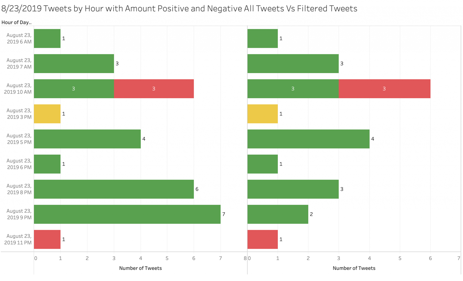 Figure 1: Tweets Per hour All tweets on left Filtered tweets on right
As we see in Figure 1 August 23rd was a pretty normal day for trump with the total number of tweets for the day on the low side compared to his normal daily average of about forty-five tweets per day. On this day he had about thirty tweets for all his tweets including retweets and twenty-two tweets for market related tweets but of those tweets only seven of them happened during the trading hours of the market. The tweets which happened during market trading hours which is 9:30am to 4:00pm EST, three of them had positive sentiment, three of them had negative sentiment, and one of them had neutral sentiment so there was a pretty even distribution of tweets. When we then graph S&P 500 Price vs Filtered tweet volume for that day such as is seen in Figure 2, we get some interesting result as seen below.
 Figure 2: Graph of S&P 500 Price vs Filtered Tweet Volume
When we graph S&P 500 Price vs Filtered tweet volume like what we did in figure 2 where the graph for tweet volume is also color coded for sentiment with the color red being negative sentiment, yellow being neutral sentiment, and green being positive sentiment. The graph of S&P 500 price is color coded for increase and decrease in price with green being increase in price and red being decrease in price. What we see is that the market is responding pretty normal until 11 am when President Trump tweets first two tweets then another four tweets all which had negative sentiment. All of a sudden two minutes after the tweet we see a decline in price. This is further confirmed when looking of a graph of S&P 500 Volume vs Filtered Tweet volume as seen in Figure 3 below.
 Figure 3: Graph of S&P 500 Volume vs Filtered Tweet Volume
When we look at the graph of S&P 500 Volume vs Filtered Tweet Volume as seen in Figure 3 we get data to confirm what we saw in Figure 2. At the time that the tweets happen we see there is a spike in Volume following the six tweets. This spike happens about two minutes after the tweets are tweeted. The volume then returns to normal volume for the day after the tweets stop.This is further confirmed when looking at graphs of S&P 500 Volume vs Filtered Tweet Sentiment which is seen in figure 4 and S&P 500 Price vs Filtered Tweet Sentiment which is seen in figure 4 both of which are below.
 Figure 4: S&P 500 Volume vs Filtered Tweet Sentiment
When we graph the S&P 500 Volume vs Filtered Tweet Sentiment, as seen in figure 4, we again see a spike in the volume of trades corresponding to an increase in negative sentiment. When we compare figure 2 and figure 3 we see that the corresponding increase in tweet volume and overall negative sentiment correlates to a decrease in price and an increase in volume. We further confirm this by graphing S&P 500 Price vs Filtered Tweet Sentiment which is seen in figure 5 below.
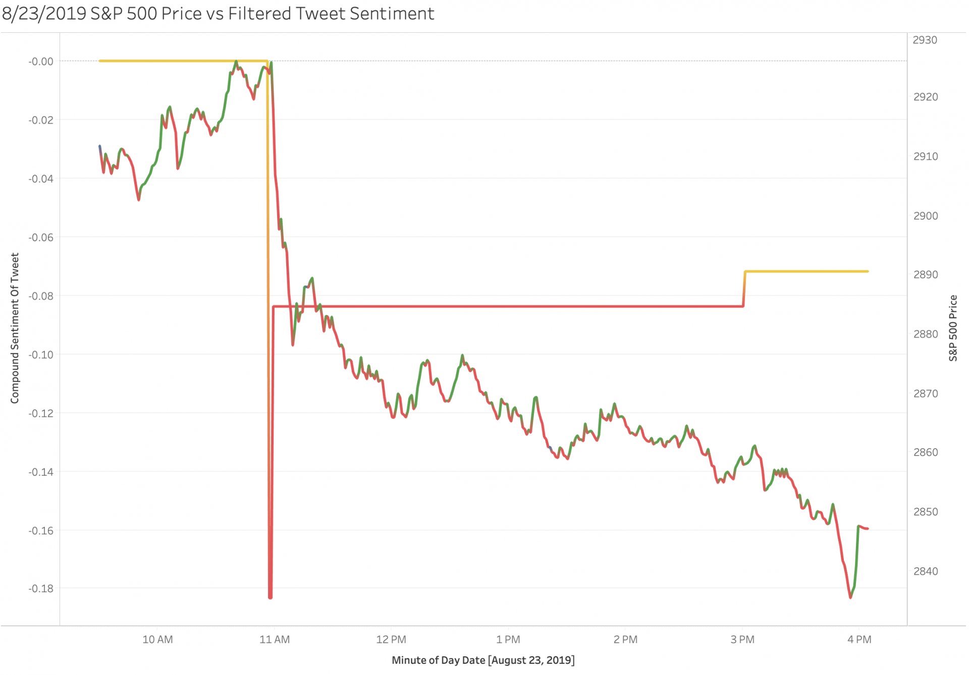 Figure 5: S&P 500 Price vs Filtered Tweet Sentiment
When we graph the S&P 500 Price vs Filtered Tweet Sentiment as seen in figure 5, we again see a decrease in price represented by a negative spike in price which directly correlates to the increase in overall negative sentiment. When we compare figure 3 and figure 5 we see that the corresponding increase in tweet volume and overall negative sentiment correlates to a decrease in price and an increase in volume thus confirming the initial hypothesis. Which was if there is an increase in Twitter volume and the sentiment is positive, we will see an increase in price and an increase in volume. If there is an increase in Twitter volume and the sentiment is negative, we will see a decrease in price and increase in volume. If twitter volume decreases, we will also see a decrease in volume until its below daily average and then it is just noise and doesn’t matter. This is best seen when you look at a graph of the Price and Volume of the S&P 500 annotated for when the tweets happen which is seen in Figure 6 below.
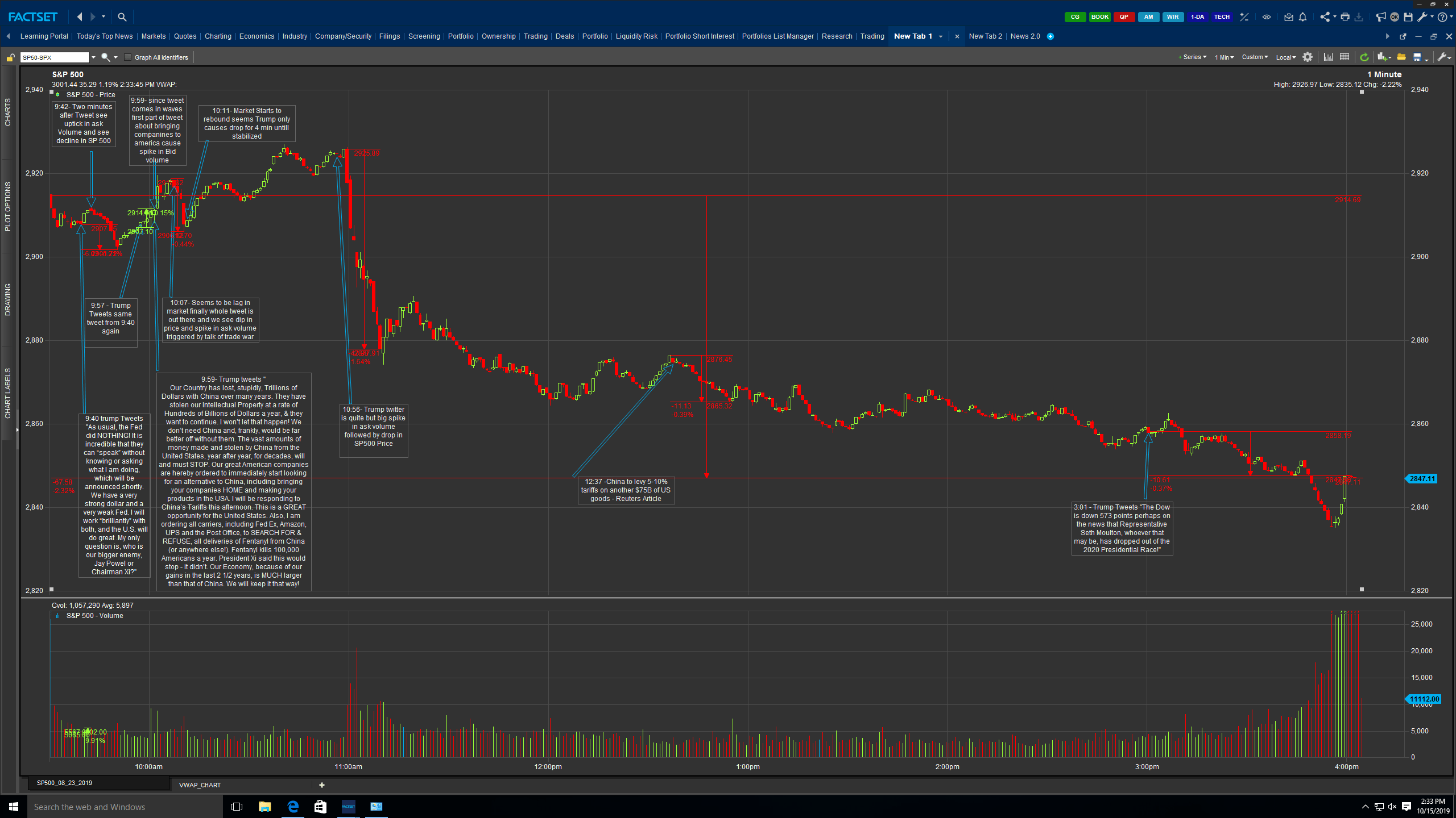 Figure 6: Annotated Graph of Tweets vs Price and Volume
The initial Results concluded that there is a correlation between stock price and twitter sentiment and volume of tweets and volume of shares traded. There is an increase in volatility in the trading price as the volume of shares increase. This spike happens roughly 2 minutes after the tweets are posted and the market stabilizes almost 10 minutes after the tweet was posted. When there is an increase in Twitter volume and the sentiment is positive there is an increase in price and volume. When there is an increase in Twitter volume and the sentiment is negative, we will see a decrease in price and increase in volume. If twitter volume decreases, we will also see a decrease in volume until it’s below the daily moving average.
If you look at the volatility at a point in time and compare to sentiment you should see that the volatility is high overall negative sentiment is high, positive sentiment is low and overall market price is down. The inverse holds true as well. If you look at volatility at a point in time and compare to sentiment you should see that the volatility is low overall negative sentiment is low, positive sentiment is high and overall market price is up. When the sentiment is neutral, we can just ignore the tweets since it is just noise since the market only responds to extremely negative and extremely positive tweets. Thus, the sentiment of Tweets should be able to predict volatility of the market since volatility is contradicting signal.
Volatility with then in turn predict market movement in either up or down direction since efficient markets prefer to be smooth. While taking into account that the more tweets will mean higher volatility and a greater swing in price since the number of tweets and their corresponding negative and positive sentiment to net real movement in the market is very high, since markets only respond to extremes such as very which is due to the fundamental market theories since the market is constantly adjusting to new market variables.
Holding true that investors are really only looking for news that has economic policy relation since markets are looking for expansion the greatest changes in volatility would come from the tweets that have negative sentiment and mention items like trade war tariffs and increase in interest rates all things that would negatively affect market growth. For tweets with positive sentiment with mention positive growth we would not expect to see much change in the market since investors are always assuming the market will be efficient and preform.
My hypothesis then after reviewing the preliminary data is that negative sentiment will be a better predictor of volatility and will have a higher correlation with volatility because people react more to bad news than good news i.e. after 9/11 investors shorted the airlines. Also, the mentality of investors is to buy low and sell high so if dip is coming investors will hop on the bandwagon and sell which leads to drop in price which then leads to correction which leads to a spike in the price until the price reflects all the information available to the market. With the next steps being testing if it is possible that a model that uses sentiment to predict volatility is better than one that doesn’t use sentiment.