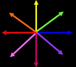
Displaying the Model Output

Once the magnitude and direction of the response at each pixel is calculated from the components, we can display the resulting data in a variety of ways. Two displays that have been found particularly useful are intensity maps and three-dimensional surface plots. For the intensity maps, each pixel is assigned a color based on the direction detected. The color assignments are shown in the color wheel at the top. Then, each pixel is assigned an intensity. Pixels that showed little or no detected movement appear black, while those with strong movement detected appear in bright colors.
Often, an entire object will not be seen moving in a single direction and will appear multi-colored. The image in the center, below, shows an intensity map of the motion detected at the end of the bird’s movement. The right wing area of the bird is shown in blue, indicating rightward movement, while the left wing and head appear in orange and red, indicating upward and rightward movement. This corresponds to the video, as the bird, toward the end of the sequence, moves its head up to the left while turning its body so that its tail and right wing move to the right.
The three-dimensional plot on the right shows color, but this color simply indicates the height of the graph rather than the direction of motion. The still image is from the same frame of the bird’s motion, but turned slightly counter-clockwise to make the perspective more visible. Using this method, it is easiest to see which areas of the image produce the greatest response in the detector.


