The purpose of this post is to discuss the key elements in developing an interactive web application that displays data with geographic component. I discuss developing an app using Shiny – a powerful R package. I briefly compare that process to building a similar product in Tableau. Rather than going line-by-line through code, I highlight key decisions, some programming issues and capabilities of Shiny, focusing on the potential for combining free data with open-source tools to create useful data products.
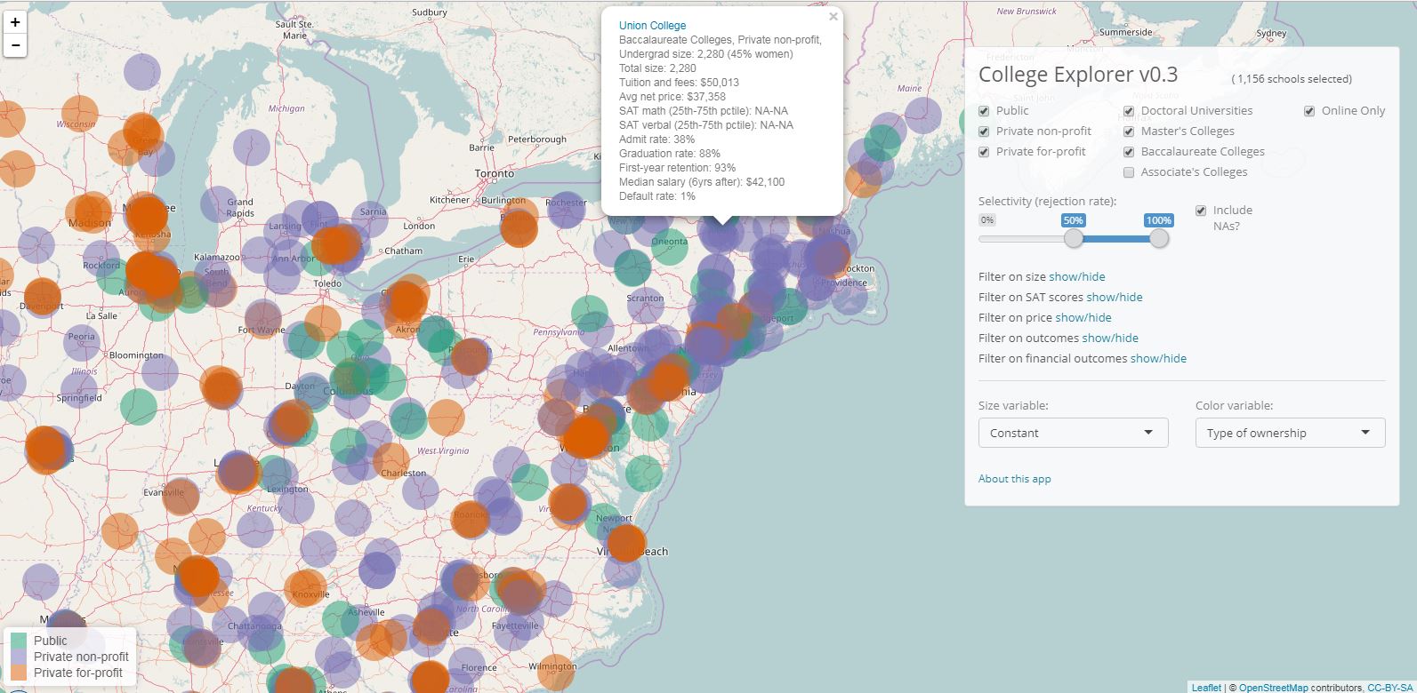
As an illustration I use College Explorer – a Shiny web app I developed. The app was inspired by ZIP Explorer. It lets users explore data on U.S. colleges and universities while displaying their geographic location on a map. The colleges displayed, and the color and size of the markers are controlled with sliders and drop-down lists. The sliders and drop-down lists are driven by a variety of criteria: college or university selectivity, size, cost, SAT scores, salaries, etc. When a user clicks on a marker, a pop-up window will appears with information and a link to the college or university website. Compared to existing college search tools, this app combines quantitative and qualitative criteria with geographic location, enabling familiar map zooming and panning. Here is what the app looks like:

Data Preparation:
We rarely encounter data that is out-of-the-box ready for analysis or visualization. Metrics need to be calculated (e.g. college selectivity equals admitted students divided by total applications), and categorical variables might need to be consolidated (e.g. most classifications of colleges and universities have 10-20 categories – a bit too many for effective visualization). Data sources may need to be combined (e.g. my data comes from eight different IPEDS files and one CollegeScorecard file — two publicly available data sets). The key in data preparation is to automate the preparation as much as possible. Using API to access the data is ideal, but if API does not exist, raw data should be manipulated with code so that the manipulation is reproducible and can be easily updated. The code to update College Explorer is about 150 lines. It combines nine different raw data files, selects and calculates variables and outputs a single data set used by the app.
Interactivity:
Shiny provides a full slate of interactive elements: sliders, check boxes, drop-down lists. I use interactivity to filter which colleges are displayed, and to control which characteristics (e.g. size, selectivity, or type) are mapped to color and size of the markers. In the context of searching among thousands of items, colleges and universities in our case, filtering is perhaps the most useful way of interacting with the data. Users see colleges appear and disappear on the map, as well the total number of colleges that match their criteria. An important decision for designers is how to treat missing values when filtering observations. If a user filters on a certain criterion (e.g. SAT scores), should colleges that have missing values for that criterion be included or excluded? In College Explorer I let the users decide by checking a box “Include NAs?” (Tableau provides a similar functionality).
Design:
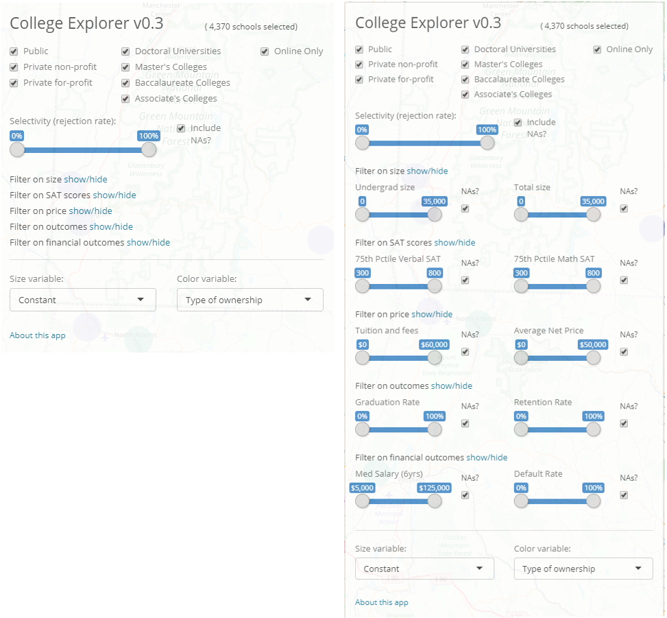
Builders of interactive data apps need to strike a balance between the sufficient number of interactive features and uncluttered design. For example, the number of variables by which the user can filter data must be weighed against overwhelming the user with too many choices. The optimal balance depends on the context of the app. In College Explorer I let users filter by type, selectivity, test scores, size, price, graduation and financial outcomes. To avoid filling the screen with sliders, I use the shinyjs package to show and hide the sliders. Another design feature is the what happens when mouse hovers or clicks on a marker. On hover, the name of the college and university appears. On click, an information sheet appears over the marker including a link to the college’s website. The images below show the control panels with and without the interactive features hidden. 
Shiny Coding:
The basic set up of Shiny apps is well covered elsewhere. The specific structure of College Explorer is as follows: The server.R function creates a “reactive” data frame with information on colleges and universities. The data frame is “reactive” because it filters observations based on inputs from the ui.R function. The map is drawn with leaflet function while the markers on the map are plotted with leafetProxy. The leafletProxy is inside an observe function that re-executes leafletProxy each time the data inside it changes. This setup ensures that the map is rendered only once, while markers on the map change whenever parameters (e.g. filters) change.
The interactive nature of the app means that size and color need to be coded so that they work with any variable that can be mapped to size and color. For example, the color scheme in the legend would change based on which types of schools are included in the display. In order to ensure that each type is always coded with the same color, I “hard-code” colors associated with each type. Similarly, the size of the marker needs to have reasonable values, regardless of whether size is mapped to a variable that ranges from zero to one, or a variable that ranges from zero to a million. Therefore, for marker size I use the square root of the variable divided by its 95th percentile. I use 95th percentile instead of maximum to avoid undue influence of outliers.
The ui.R function sets up a bootstrap page with leafletOutput spanning 100% width and height, filling the screen with a leaflet map. The interactivity controls are inside a draggable absolutePanel. I modified a standard bootstrap.css file to set transparency of #controls to 0.88 so that the map behind the controls is slightly visible, giving the control panel impression of lightly gliding over the map. The process of deploying the app on shinyapps.io via RStudio is seamless.
Tableau Comparison:
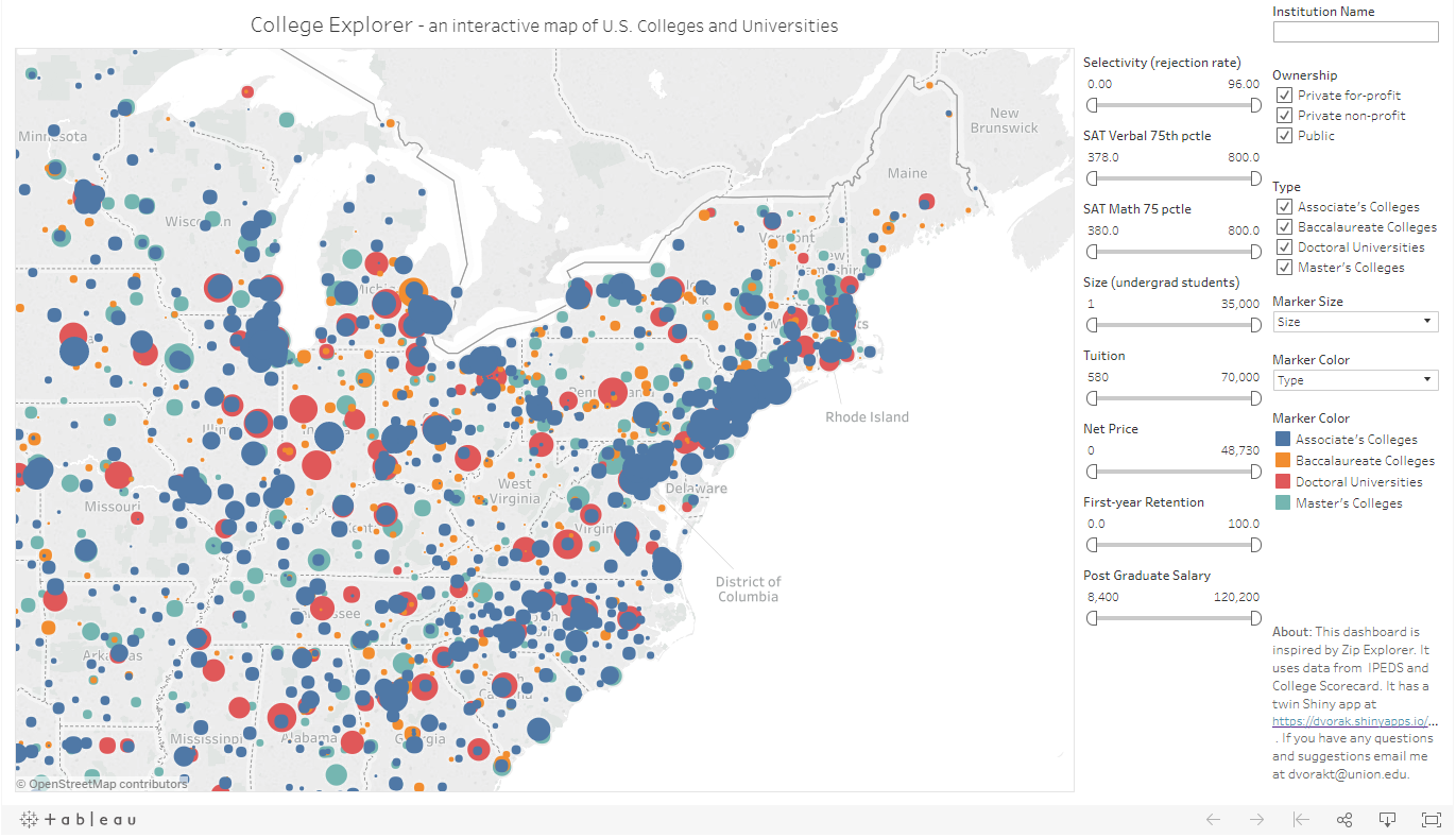
I connected the data I prepared for the Shiny app to Tableau and built a Tableau dashboard with almost identical functionality as the Shiny app. For developers with experience in either technology, building the app in Shiny or Tableau would take roughly the same amount of time. However, the nature of the work is very different. While building Shiny requires code, Tableau is point-and-click. Shiny has the advantage of being open source, and it provides designers with more control, including the option to modify the underlying html code and .css styles. This is particularly convenient with shinythemes. You can see the look of the Tableau dashboard below. 
Conclusion:
Today’s technology has significantly reduced barriers to building map-based interactive apps. With a little more than 200 lines of code (which include extensive comments), the Shiny app lets users interact with rich data, and browse locations of U.S. colleges and universities. Tableau and, no doubt, its competitors such as Power BI, can accomplish the same thing. Thus, developers have numerous platforms to choose from. Only one’s imagination limits how these powerful technologies are used.
