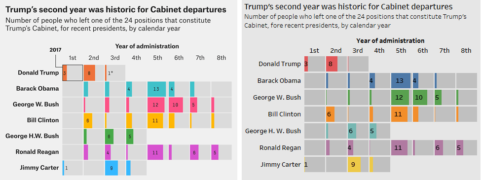
Showing cabinet departures for recent presidents was one of 56 “best and weirdest” charts of FiveThirtyEight in 2019. I asked my students to replicate the chart in Tableau. See if you can tell which of the above images is the FiveThirtyEight chart, and which is my Tableau replication. The task has three key learning objectives. First: how to set up the data. What should the columns be? What is the proper level of granularity? Second: create a grid of dual axis bar charts. Creating a grid of bar charts is easy in Tableau. (Put one dimension on Rows, another dimension on columns, a measure on either.) The harder part is getting a grey bar filling up the year of administration. The key is putting two measures on the same shelf and using dual axis to overlay two bars on top of each other. Third: use Tableau’s formatting. Tableau gives users tremendous control over the final look of the viz: from sorting the order of dimensions, to font size, to which marks are labeled, to grid lines, to spaces between panes, to background color. This exercise provides an opportunity to use all of these controls. The data is here. A quick video of putting the viz together is here. The final viz on Tableau Public is here.
Replicating a FiveThirtyEight chart in Tableau