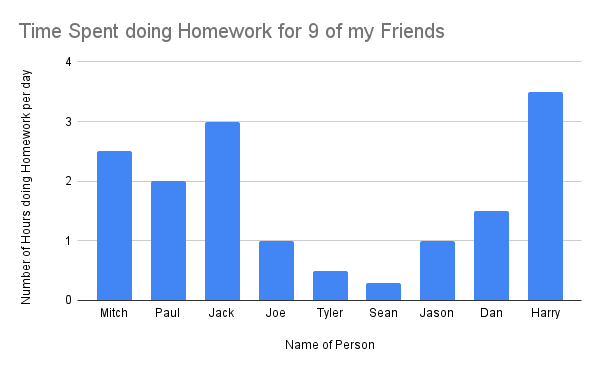
 This is a graph that I made about the average amount of time that 9 of my friends spend doing homework per day. The Y-axis is the number of hours spent doing homework, whereas the x-axis is the name of my friend.
Mathematics of Sustainability
Union College MTH-063-01 Spring 2022

This is a really cool way to analyze study time and habits, and the data is definitely useful!
This is so interesting! I like how you interviewed your friends for your data.
I wish I was like Sean!