
Of course we know now that emissions of carbon dioxide are incredibly harmful to our earth and the ozone. As one of the most prominent and dangerous green house gasses, limiting carbon dioxide emissions is crucial to saving our planet before it heats up to a point of no return. The graph that I am going to conduct is relatively simple but it will be stats on some of the largest and most industrialized countries in the world and the numbers that relate to their C02 emissions.
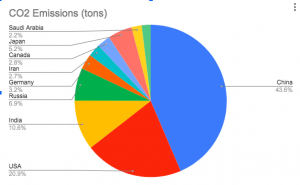
These ten countries make up nearly 70% of the worlds CO2 emissions and of these 10 countries, China make sup 43.6% of the emissions. These countries are all very industrialized and have shown large jumps in population growth. If that growth continues, some policies have to implemented to lower these emissions!
I like your choice of using a pie chart to represent this data! It makes it very easy to see that China is making up most of the emissions.
Seeing that only 10 countries make up 70% of the world’s CO2 emissions is concerning given how many countries there are on Earth.
It’s interesting to see how much Carbon each country emits. Notice China is the largest by far. Good work man.
The pie chart really emphasizes just how big the CO2 emissions of industrialized countries are. As leaders in the industrialized world, the massive difference in CO2 emissions that the US and China have compared to other countries is super big.
Thank you for sharing this. This is great mathematical content. The pie chart made it really clear how much co2 emissions are increasing