
For this post, I decided to look at various household income levels in the U.S. and how they’ve changed over time. Specifically, I wanted to see what percentage of the population belongs to the highest bracket of income (>$200,000) and the lowest bracket (<$15,000). My source for this was the U.S. census bureau, which had helpful downloadable charts on poverty and income levels. The chart I looked at broke down income levels by race as well.
The change in income levels from 1967 to now is interesting and requires a bit of unpacking. These two graphs I made help visualize this change. One is a bar graph and the other is a line graph.
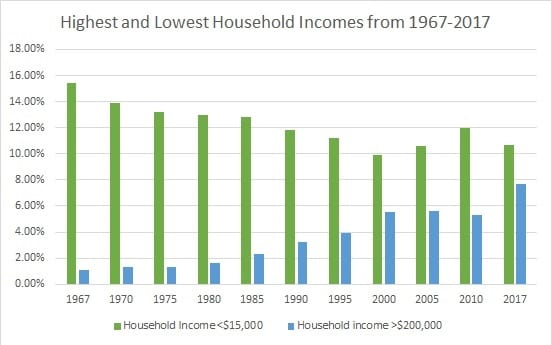
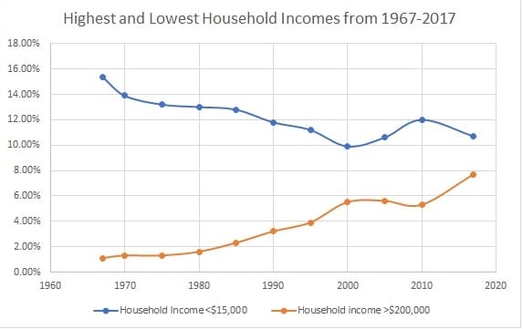
Both graphs show that in the last 50 years or so there became more households in the $200,000 threshold, and less households in the $15,000 threshold. This might point to the idea that there is considerably more wealth now than there was in the 1960’s. While this might be true, there are several other factor that can be taken into account. The largest of these is inflation. The value of a dollar has gone down since the 1960’s. According to dollartimes.com, $300 in 1967 would be worth $2,250 today. This explains why there were so few households with >$200,000 in the 1960’s, as that money then would have been worth around $1,500,000 today. Coupled with this is the idea that someone could successfully live off a $15,000 a year salary in the 1960’s, but that certainly isn’t possible now. It’s unfortunate that some people have to live in this threshold. Doing things such as raising the minimum wage might help, but its hard to determine what the exact effects of doing this would be. It would probably improve the lives of some workers, but it might also contribute to inflation, and a push by companies to use automated workers instead. One other brief observation about the graph is the brief dip around 2008-2010. This likely has to do with the stock market crash of 2008.

I found your data very interesting because it does in fact show just how drastically the value of the dollar has risen over the past four decades. I also agree with your statement that there is more wealth in society now than in the past. Raising minimum wage does seem like a likely cause to improve the wealth distribution in our country, and it could very well fix the problem. However, I’m curious as to why that may be true and what may have caused this drastic increase in wealth.
In terms of inflation, just as you said, these are interesting statistics. I think that is the most important factor to this data, and I agree that this might point to a growing amount of wealth in the country. However, it would be interesting to analyze this data in terms of the increase of the normality of a dual-income household. In the 1960’s it was less common to have two incomes sustaining a household which then it is today. Maybe an interesting comparison to make?
What I find so interesting about this post is the difference in value that the us dollar had in the late 60s versus now. You mention more wealthy people in America as a factor of the declining dollar value which could perhaps coincide with the amount of people in America now than resided in the 60s. http://www.multpl.com/united-states-population/table has 1967’s population in America recorded as 198.71 million people compared to 328.7 million that are in the US today.