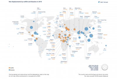
Internal Displacement and Apathy

The issue of internal and external migration of people is something I am very passionate about, and I think it is fascinating the amount of factors that provoke the migration of people whether the factors be environmental, violence, race, lack of resources, economics, etc. According to the 2017 Global Report on Internal Displacement, the global rate of internal displacement in 2016 was equivalent to one person forced to flee every second totaling to 31.1 million new internal displacements catalyzed by conflict, violence, and disasters in one years time.

In 2015 according the UNHCR there was a total of 40.8 million internally displaced peoples which means if we add the new figure of 2016 to that of the 2015 figure on internally displaced people the growth rate would be approximately 1.76 of internally displaced people globally and a rate of change from 2015 to 2016 of 31.1 million people displaced/year. Even though these figures are staggering, according to the IDMC, “Each year, IDMC provides robust, compelling evidence on internal displacement. Each year, the evidence fails to elicit a response commensurate with the scale of the problem. Why? Because of international indifference, lack of accountability, and state failure to protect.”

Giant Panda Population Increasing After Being Called Extinct

Through my research of trying to find an article regarding the topic of growth and decay, I decided to focus in on the the topic of the giant panda population, and how they have been deemed a “vulnerable”, rather than an “extinct”, species. I read about it in this article.

The giant panda population has been known as the “world’s most beloved conservation icon”. Acting as the symbol of WWF, the World Wildlife Fund, the giant panda’s population increase is a relief to so many, as it is showing that conservation efforts are paying off in the end.

In the article, it is stated that there was a 17% rise in the giant panda population leading up to 2014. This was when the census recorded 1,864 giant pandas in the wild in China.

What this increase in the panda population shows us is that when people come together for a common cause, they are able to make a major difference in the environment. People and communities have been battling this extinction for quite some time, and the efforts are proving successful.

Wildlife Populations

In the World Wildlife Fund’s 2016 Living Planet Report, the organization reported that there was 58% decrease (.42 decay factor) in the populations of vertebrate animals from 1970 to 2012, such as mammals and birds. The terrestrial population decreased by 38%, a .62 decay factor. Even more alarmingly, WWF found that the populations of freshwater animal species decreased by 81% (.19 decay factor) from 1970 to 2012. These numbers are equally shocking and terrifying to me. Only 19% of the 1970 freshwater animal population still remained in 2012.

What is the reason for these extreme drops in animal populations? The World Wildlife Fund gives us 4 main reasons why this has occurred. First, habitat loss and degradation as a result of commercial and residential development. Second, our food systems have a negative impact on the natural world, such as overfishing. Third, climate change requires animals to adapt to different environments, damaging reproductive cycles and migration timing. Finally, species overexploitation harms animal populations. Sometimes this is direct and intentional, such as with illegal hunting, and other times it is unintentional, such as catching one type of fish when you meant to catch another type.

People should stay away from wildlife crime, it is both wrong and unsustainable. In addition, everyday changes we can make to our lifestyle to prevent climate change can help stop this massive decrease in animal populations.

Quantifying Increase in Drug Offenses in Federal Prison Population

In my last post, I created figures depicting the overall trends in the general federal prison population as well as these trends broken down to account for different types of offenses. I was especially intrigued by the information on the prevalence of drug offenses leading to incarceration from 1990 to 2014. From looking at the graph, it is clear that the drug offenses have accounted for the greatest proportion of crimes leading to incarceration on the federal level. The green line used for this offense on the graph stands out and reaches much higher than the other ones. It is also clear from looking at this figure that the most significant increase in drug offenses was at the beginning of the figure, from 1990 to 2000 and it seems to level off somewhat from 2000 to 2014. Due to this interesting trend, I did calculations to specifically quantify the increase in drug offenses during this time.

I first focused on the time period of 1990 (31,300 inmates) to 2000 (74,276 inmates). During this time, there was an overall increase of 42,976 federally incarcerated drug offenders, therefore the number increased by an average increase of about 4,297 inmates per year over these 10 years. This means that the number of drug offenders increased by 137% from 1990 to 2000 and increased by about 13.7% each year during this time period. This is a huge increase from both the 10-year unit perspective and when it’s broken down into yearly increases. An increase of 137% overall means that the number of drug offenders in 2000 increased by double plus one-third of the population in 1990.

I also examined the period of time where these numbers seemed to level off. Often, when you see a graph level off after a large increase or decrease, it appears stable and resolved at first glance. But, a seemingly stable line could still indicate a significant change. Between the years 2000 and 2014, the number of drug offenses increased by a total of 21,524 people and over these 14 years there was an increase of 1,537 offenders each year. This indicates an increase of 2.1% per year over these 14 years. This seems like a minor change that may not be important, but when you look at the total increase, the impact appears much greater. This 2.1% yearly increase led to a 29% overall increase in drug offense incarcerations from 2000 to 2014. Although this increase is not as dramatic as the increase between 1990 and 2000, this still accounts for almost additional one-third inmates incarcerated for drug offenses which is pretty significant.

When the time is taken to further analyze graphs such as this one, it increases the understanding of the magnitude. While an almost straight line might suggest stability at first glance, further investigating the relationship results in a more thorough understanding.

Tiger Populations in India, After a Long Decline, Are Finally Coming Back

Everyone, at some point in time, has named the tiger as their favorite animal, and apart from being stunning and fascinating creature they are far more important then just as a beautiful animal. An obvious benefit to the existence of the tiger is the fact that, as a major predator, they maintain balanced ecosystems within their own habitats. Another less apparent benefit is economically, since tigers are mainly found in large numbers in areas with high poverty rates, such as India or Nepal, the presence of larger numbers of tigers will eventually lead to a tourist trade. This new tourist trade can benefit small businesses in rural communities and provide a greater flow of currency through these areas.

India conducts a census of tiger population every four years, and there latest census for 2018 is set to be released in January of 2019 with tiger numbers estimated to cross over the 3,000 mark. As of 2014 the tiger population was set at 2,226 tigers left in the wild, up 520 from the 2010 number of 1706, which marks the first time that tiger populations have been steadily increasing in one hundred years. The growth factor, just using those most recent values, comes out to around 1.30 with a percentage change of 30.5%, and a rate of change of about 130 tiger increase per year. Strictly looking at these values of exponential growth the 2018 census numbers may fall short of the 3,000 estimation around 2,894 wild tigers. The most recent worldwide numbers for tiger population stand around 3,890.

Ebola Exponential Growth

Growth and decay are able to illustrate interesting phenomenon’s and are able to show the real issue with good and bad things as they change overtime. Although it is usually more negative in some cases for exponential decay, the article that I investigated was regarding exponential growth revolving around a terrible medical condition, Ebola. The article was able to first site the medical issues and causes that have come from this awful disease, however more shockingly was the graph that they provided showing the increase in diagnosis of Ebola since its initial outbreak and recording. Even within the article one doctor is quoted saying, “This is a disease outbreak that is advancing in an exponential fashion,”- Dr. David Nabarro. This is related to our class due to the fashion in which the data was collected and plotted but it is also such a terrible medical condition that is exponentially destroying the population- tying to our overall definition of sustainability. I found this article and topic to be extremely interesting, scary, and relatable to our course.

Another great aspect to this article is that they break down is where their initial data came from and why it may contribute to the overall Ebola outbreaks. This directly ties indo course regarding the sustainability of human population.


Predicting How The Ebola Epidemic Will Grow

Researchers at Columbia University developed a model to forecast how the current Ebola epidemic might continue through mid-October, based on the infection rates as of Sept. 7. The “no change” forecast assumes that current efforts at stopping the virus will continue at the same rate of effectiveness. The “improved” forecast assumes that interventions will become more effective.

·       Infections

·       Forecast: No change

·       Forecast: Improved

07/1307/2007/2708/0308/1008/1708/2408/3109/0709/1409/2109/2810/0510/1210/1905,00010,00015,00020,0004,36615,6027,750

Source: Columbia Prediction of Infectious Diseases, World Health Organization

Credit: Alyson Hurt/NPR

https://www.npr.org/sections/goatsandsoda/2014/09/18/349341606/why-the-math-of-the-ebola-epidemic-is-so-scary