$15 Minimum Wage? Think Again.

There has been, for years now, clamoring in political and economic circles to raise the government-mandated minimum wage to $15/hour.

Now, this sounds fantastic on paper. After all, who wouldn’t want to make $15 an hour?

Yet, there’s a simple problem with the $15 minimum wage: raising the minimum wage only raises the cost of living.

Think about it in basic terms. I’ve used my family’s pizzeria business before as an example, and I’ll do so again here.

Currently, I make $10.40/hour. That is, after all, the current New York State Minimum Wage. My family’s pizza business employs, let’s say, 10 workers. All 10 of these workers make minimum wage. Let’s say each person works 25 hours a week. That is to say that, per week, the business pays $2,600/week in wages.

($10.40/hour) x (25 hours/week)= $260/worker ———- ($260) x (10 workers) = $2600/week

Now let’s say, all of a sudden, the minimum wage jumps to $12.50/hour, as it is scheduled to do by the end of 2020. Now, the business must pay $3,125/week in wages.

($12.50/hour) x (25 hours/week) = $312.50/worker ———- (312.50) x (10 workers) = $3125/week

Now, this is fantastic for the individual worker. Working the same number of hours, and doing the same work, they see their weekly income rise by over $50.

Yet, for the small business owner, this is unfortunate. The small business owner now must come up with an additional $500+ to pay their employees. That money doesn’t simply fall out of the sky, or off of a tree. How do they reckon with this? They take the only reasonable avenue available to them. The business owner passes the cost onto the consumer. They raise their prices.

Now, our employee has to pay $8.00 for a cheese pizza when it used to cost $6.00. They have to pay $12.00 to see a movie at a local theatre, when it used to cost $9.00.

Soon enough, the $50 raise they got as a result of a rising minimum wage is gone. It evaporates into thin air.

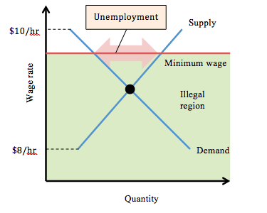
I attached some pretty rudimentary graphs below to try to help illustrate.

Will equal pay ever exist?

According to the Institute For Women’s Policy Research, women, on average, earn less than men in almost every occupation. In an article by Emmie Martin, of CNBC, I found the median income for American women both weekly and annually. The earnings were also divided between seven separate age groups: 16-19, 20-24, 25-34, 35-44, 45-54, 55-64, and 65+. For comparison purposes, the article also divulged the median income of American men at the same age. In my graph below, the men (blue) and women (pink) show the pay deficit between genders in America.

According to the same research, for every dollar earned by a man working full-time, year-round, a woman working full-time year-round earns $0.76. Another disturbing aspect of this debate is the fact that it does not take race into consideration. The IWPR tracks the gender wage gap and has found that if change continues at such a slow pace, it will take another 41 years (on top of the 55 that have already passed) for women to finally receive equal pay. The IWPR also reports that Hispanic women will have to wait until 2233 and Black


Change in Household Incomes since 1967

For this post, I decided to look at various household income levels in the U.S. and how they’ve changed over time.  Specifically, I wanted to see what percentage of the population belongs to the highest bracket of income (>$200,000) and the lowest bracket (<$15,000).  My source for this was the U.S. census bureau, which had helpful downloadable charts on poverty and income levels.  The chart I looked at broke down income levels by race as well.

The change in income levels from 1967 to now is interesting and requires a bit of unpacking.  These two graphs I made help visualize this change.  One is a bar graph and the other is a line graph.

Both graphs show that in the last 50 years or so there became more households in the $200,000 threshold, and less households in the $15,000 threshold.  This might point to the idea that there is considerably more wealth now than there was in the 1960’s.  While this might be true, there are several other factor that can be taken into account.  The largest of these is inflation.  The value of a dollar has gone down since the 1960’s.  According to dollartimes.com, $300 in 1967 would be worth $2,250 today.  This explains why there were so few households with >$200,000 in the 1960’s, as that money then would have been worth around $1,500,000 today.  Coupled with this is the idea that someone could successfully live off a $15,000 a year salary in the 1960’s, but that certainly isn’t possible now.  It’s unfortunate that some people have to live in this threshold.  Doing things such as raising the minimum wage might help, but its hard to determine what the exact effects of doing this would be.  It would probably improve the lives of some workers, but it might also contribute to inflation, and a push by companies to use automated workers instead.  One other brief observation about the graph is the brief dip around 2008-2010.  This likely has to do with the stock market crash of 2008.

Green gentrification in Brooklyn

Brooklyn is one of the five boroughs located in New York City and it is recognized as a global city, a green city, and a gentrifying city.  It is a global city because there are 2.5 million residents and one-third of its residents were born outside of the U.S.  Brooklyn has becoming self-consciously “green” in the twenty first century with a number of recent high-profile LEED certified buildings, new bike routes, and ambitious greenways are highlighted, as well as the high ratings local elected officials receive from environmental advocacy groups.  Kenneth A. Gould and Tammy L. Lewis, authors of “Green Gentrification: Urban Sustainability and the Struggle for Environmental Justice”, argue that this increased “greening” occurring in Brooklyn is leading to a jump in the city’s gentrification rate.  Much of the city’s growth is due to internal migration meaning Americans are flocking to Brooklyn and foreign immigrants are being forced out of the city they’ve lived in for decades.  “Green gentrification” is defined as the appropriation of the economic values of an environmental resource by one class from another (Gould & Lewis, 25).  This means that as environmental resources in Brooklyn become more available as amenities, that area of Brooklyn becomes more attractive to the wealthy, white in-migrants of the U.S.

I took data provided in Gould & Lewis’s book that was focused on Brooklyn as a whole, as opposed to a single neighborhood, and graphed the increase of the white population compared to the decrease of the black population from 1990 to 2014.

As the graph shows, the green bar represents the black percentage in Brooklyn which has been gradually decreasing as the blue bar, which represents the white percentage in Brooklyn, has stayed steadily higher from 1990 to 2014.  Gould and Lewis argue that this is a result of green gentrification and environmental injustice in Brooklyn because wealthier, white residents are attracted to the quality of environmental amenities and push out low-income, black residents in the process.


Plant-Based Foods vs Animal-Based Foods

The production of animal based foods is an issue we have been discussing in class for the past few weeks and this chart helps break down consumption of meats and vegetables. The chart shows the required land, water consumption, and GHG Emissions for produces like wheat, rice, eggs, pork, and beef. The charts are higher when it comes to the consumption of meat as it takes more resource to cultivate. Producing animal-based foods is responsible for more than three-quarters  agricultural land use around the world. The amount of land it takes to raise cattle is neisse compared to the land needed for agriculture. The resources that would be used on agriculture would not only be cheaper but have more benefit for everyone. Agriculture’s production-related greenhouse gas emissions is less compared to that of meat related consumption because of waste in resources. Because many animal-based foods rely on crops for feed, increased demand for animal-based foods widens the food gap relative to increased demand for plant-based foods.

The Frequency of Natural Disasters

Certain areas across the United States have been targeted most by natural disasters. For example, In the last 16 years, Louisiana has seen 6 hurricanes. Additionally, California has become more prone to wildfires. The graph below shows the annual losses in billion dollars each year since 1980. It is clear that in the last 40 years, the amount of billion dollar disasters has increased, significantly. It is also clear that these disasters have become much more frequent. In the first 3 months of 2018, 3 big storms hit. One of the three was Hurricane Harvey with damages that cost $125 billion which was right up there with the costs of Hurricane Katrina in 2006. The graph below also shows that while 2018 has been the most costly year so far in terms of natural disasters. The overall costs of natural disasters has increased significantly since 1980.

Continue reading

Graph of Global CO2 Emissions

The website “Our world in data” specializes in gathering data, assessing it, and presenting it effectively through graphs.  Looking purely at numbers and trying to distill a trend or message from them is often quite difficult.  I think this website does an effective job of presenting important world data in an interesting manner.  The specific article I found the graph on is titled “CO2 and other Greenhouse Gas Emissions,” by Hannah Ritchie and Max Roser.  They elaborate on the role CO2 plays in our atmosphere (its processes and interactions with plants and humans) and give close to 30 graphs that show various statistics.  Levels of methane, nitrous oxide, are shown, along with representations of various GHG outputs by country.  All the graphs are interactive, and you are able to click on them to learn more.

The graph I chose to present deals with the global CO2 levels worldwide in recent history.  A line graph of sorts, it breaks down global CO2 emissions, but distinguishes each countries output by color.  The graph starts in the year 1751, so its interesting to see how little CO2 was emitted early on compared to now.  Industrialization and the rise of the world’s population are obviously the largest factors in play here with this trend.  However, even from 1990 to 2015, there was a significant jump, where CO2 emissions almost doubled.  In looking at the division of countries by color, one can see that the U.S. and China make up the bulk of world emissions.  China has slightly larger emissions than the U.S. currently.  I think it’s interesting to see that no other singular country comes close to the U.S. or China in terms of emissions.


Image result for countries that emit the most waste graphs

Unilever’s Sustainability Report

The huge corporation, Unilever, whose company mission statement states, “We meet everyday needs for nutrition, hygiene and personal car with brands that help people feel good, look good and get more out of life” started a sustainability campaign in 2010 due to increased distaste from the public with regard to Unilever products.  Every year the company conducts a “Sustainable Living Plan” progress report and in the first year of the campaign the company’s greenhouse gas intensity fell 16% from 118.31 to 99.97 kg per metric ton of production, as seen in the pie chart.  According to this chart which was included in the progress report the highest amount of greenhouse gas emission comes from customer use of soaps, shampoos and shower gels.  As of 2018 the company has set a target to double its business while halving the environmental footprint of its products across the value chain, and sourcing 100% of agricultural raw materials sustainably, all by 2020.  This goal was set in 2010 so the 2020 goal seemed lightyears away but with 2020 right around the corner, data analysts have criticized Unilever for not providing the whole picture with regard to their sustainability progress.  Specifically in the 2011-2012 progress report there was no data to back up this chart, there was only the chart.  On the Unilever website, the company claims that that it is on-plan for every individual sustainable sourcing target thus far.  I suppose we’ll find out in two years.

The Social Safety Net is Not Sustainable

The Social Security Administration was created in 1935, as part of the New Deal legislation enacted by the Roosevelt Administration. The idea was this: create a social safety net wherein older workers could retire from the workforce without the risk of going broke, and in the process create additional job openings for the unemployed masses of the Great Depression.

If it seems to you like a brilliant idea, in more ways than one, that’s because it was. It was absolute political genius.

But there was a catch.

Finding a way to pay for it.

So the government, in its infinite wisdom, kicked the proverbial can down the road. They used the present workforce to bankroll the retirement of the one about to retire. Here’s how it worked:

I receive a weekly or monthly paycheck. A portion of that paycheck, though small and almost unnoticeable, is already deducted. This is the FICA (Federal Insurance Contributions Act), or Social Security, tax. In a perfect world, the money that gets deducted from my paycheck is kept for me in government coffers until the day I retire. From that point on, I start to receive my Social Security benefits, paid for by, you guessed it, all the money I paid into the system over the years I worked.

Yet, when the system began, there were too many retirement-eligible workers who had paid nothing into the system. In order for them to receive benefits, someone had to foot the bill. Which is where the present workforce came in. The present workforce paid for the benefits of the workforce that retired before them, and the workforce which follows them pays for them. It should be, in theory, a self-sustaining system. You pay for the people who came before you, and the people who come after pay for you. That is so long as each successive generation isn’t exponentially larger than the one which follows it.

Here’s where the problem arises. The United States had, after winning World War II and in the period from 1946-1964, the Baby Boom. America produced the most populous generation of Americans in history. And now, some 54-72 years later, the present generation has to foot the bill as the Baby Boom generation leaves the workforce and enters into retirement. The problem is that the present generation is not populous enough to pay for the generation which preceded it.

There simply aren’t enough of us, and enough of our parents, to pay for the Baby Boomer retirement. It’s an unsustainable system. As the graph above demonstrates, the Social Security Administration has begun running a yearly deficit. It is paying out more in retirement benefits than it collects through tax from the present workforce. If the system goes without reform, which given the current state of American politics is entirely plausible for the foreseeable future, it will add tremendous debt to a federal budget and government already prone to deficits and debt. One unsustainable system is fueling the unsustainable nature of another.

For decades, Social Security has been called the “third rail” of American politics. That’s because it’s where all the power is, if you know how to harness it. If not, if it goes wrong, it can turn deadly. Fast.

Water Consumption of Idaho Potatoes

Most of you have probably never been, or even wanted to go to Idaho. Probably the most random state in the US, we have one thing that we are known for. This thing is so popular, in fact, that we emblazon it on our license plates! Idaho is loud and proud about our potatoes. And yes, before you laugh, there is other stuff to do there too, but potato production is the pride of the Gem State. On a more analytical level, the potato production out of Idaho alone accounts for $1.9 Billion dollars a year of profit for the state. Idaho produces more potatoes per year than any other state, with 62% being used for processed/ dehydrated foods (such as McDonald’s french fries), 29% are shipped fresh and 9% are planted for certified seed. 310,000 acres of land in Idaho are dedicated to the growth and harvest of potatoes. Last year alone, Idaho produced 134,850 cwt of potatoes. 1cwt = 112 pounds. So that means that last year, Idaho produced 15,103,200 pounds of potatoes. The average weight of one russet burbank potato (which is the most commonly produced type of potato in Idaho) is 5-7 oz. So basically, that’s a whole lot of potatoes.

As far as water is concerned, this level of growth places constant stress on the environment. Most of Idaho is high desert, which means that it is in a state of perpetual drought. An average of 34 gallons of water is required to grow just one pound of potatoes. So if we are to estimate how much water was used to grow Idaho’s potatoes last year, that figure sits somewhere in the ballpark of 513,508,800 gallons. (However, it was probably more because the number of pounds of potatoes produced, does not account for the potatoes that went bad or were contaminated in the growing process). All in all, this is a huge amount of water being used by only one state for only one crop. While the Idaho potato industry may be lucrative and historic for the state, it is not environmentally conscious nor is it sustainable at this rate.