Growth of Uber

Uber is the top ride share app in the united states. Over the past few months Uber has been in the news for the effect they have been having on traffic in NYC. The saturation of drivers got to a point where the congestion and traffic was so heavy that Mayor Bill de Blasio put a cap on the growth of Uber drivers, potentially starting a trend in major cities (major markets) across the us. This graph is the exponential growth of drivers for Uber over there starting years.

It is important to notice that this growth is exponential and driven by customer demand. What will happen when the demand increases and Uber legally cannot support it. A lot is yet to be seen  and I am interested to see how their growth will continue.


Decline of honeybees

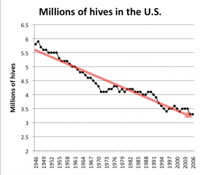
Bees have been endangered for decades now, and the chart above depicts just how much the number of bee hives in the Unites States has declined since the mid 1900s. What is still in question is the roots of the bee population problem. Some scientists are questioning whether global climate change has anything to do with the endangerment. The article I read talked about how much the bees were affected by this problem. “Climate change can influence consumer populations both directly, by affecting survival and reproduction, and indirectly, by altering resources. However, little is known about the relative importance of direct and indirect effects, particularly for species important to ecosystem functioning, like pollinators.” Although some research shows that it does in fact have to do with climate change, the direct foundations are still uncertain. Based on this chart, I decided to calculate a the percentage change to get a more accurate percentage on just how much the population of bees has changed.

The percent change from 2000 to 2006 is about 6%.

Linear Global Population Growth

The article I looked at claims that despite popular opinion, the global population is not growing exponentially, but rather is growing in a straight line. Exponential growth is described as the growth rate of the population, as a fraction of the population’s size, and is constant. Therefore, if a population has a growth rate of 2%, and it remains 2% as the population gets bigger, it’s growing exponentially. Despite the starting points of two quantities, the one quantity that grows exponentially will become larger than one growing linearly. For the United States, the population growth over the past half century has been very close to a straight line, the R2 is 0.9956.

Essentially, it seems as if people confuse the words exponentially and increasingly when talking about population growth. The graph shown demonstrates linear growth, and how exponential growth occurs only when the percentage growth rate remains constant as the population gets bigger.

Fertility Rates Throughout the One Child Policy

Is it weird to think that a country could introduce a policy that limits the amount of children a family is allowed to have? I think it is a bit odd, but I do understand the reasoning behind it. Throughout the middle of the 20th century, China’s population rapidly increased. From 1960-1975 the each woman on average gave birth to 5 children. But then, in 1979 the One Child Policy was introduced to help control the population.

This strategy worked in population control, but not with gender demographics. Because, many families still work on farms, they decide to keep the male babies and put their female babies up for adoption. This resulted in a ratio of for every 120 men, there are 100 women. This ratio then suggests that by the year 2030, there will be over quintuple the amount of males who have never married. Since this policy has been implemented and then edited, now each woman on average has 1 to 2 children.

Lets break this down,

In 1960, the fertility rate was 5.75 children per woman

In 2018,: 1.64 children per woman

Decay rate: 1.65 children / 5.75 children = .285

Percent change 1-.285 = .715 = 71.5%

–>  this suggests that there is a 71.5% decay rate of fertility per woman throughout the time in which the One Child Policy was applied.

I find it interesting that the government is controlling how many children each family is a allowed to have. As a child of the One Child Policy, I support the idea of why it the policy was applied, but it does not surprise me that there are more males and females and now the countries is concern is reproduction.

Graduation Rates

I gathered this data on Graduation Rates from United States Public Schools by race from Education Weekly. 

As you can see, graduation rates differ greatly between races. Students who identified as Asian or Pacific Islander had a 91% graduation rate, the highest out of all races. On the other hand, students who identified as American Indian or Alaska Native had a 72% graduation rate, the lowest out of all races and almost 20% lower than Asian/Pacific Islander. The chart also tells us that students who were English-Learners had a graduation rate of 67%, while students with disabilities had a graduation rate of only 66%.

I believe that this chart shows us that there are some issues with our education system. The low graduation rates for English Learners and Students with Disabilities tells us that schools should be dedicating more resources to these demographics. Students learning English or students with learning disabilities often face challenges that students without disabilities who speak English already do not face. In order to overcome these challenges and succeed, more educational resources need to be allocated in these areas.

what do Americans think about racism?

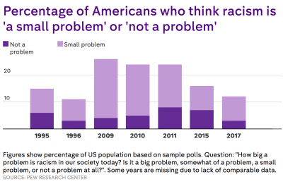
I came across data from the Pew Research Center that has polled Americans over the last 20 years asking wether they think racism is a problem or not. The data is broken down further when presented in graphs in order to track the differences in answers over the past couples decades.

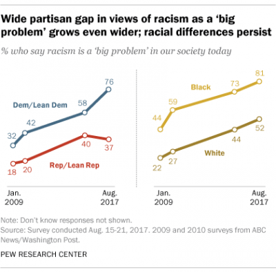
As you can see more people believe racism is a big problem today than they did 20 years ago. I thought this was interesting so I looked into some of the data further and saw graphs that compared these views with two other variables, wether the person was democrat or republican and wether they were white or black.

It is clear that both the whites and blacks that think racism is a big problem has increased over the past years. The republicans and Democrats also have seen this problem increasing. But, the democrats have exponentially increased the percentage of people who think racism is a big problem over the last few years while the republicans stayed at roughly the same percent.

Prison demographics over time

I chose to create two graphs that illustrate the growing prison population from 1990 to 2014. The issue of mass incarceration is extremely prevalent at the moment. One of the institutions of the United States which begs for significant reform is the criminal justice system. With the US being the countries with the most prisoners per capita, it is clear that efforts need to be made to reduce these numbers. I created the following graph depicting the overall rise in the prison population. You can see that the number of total inmates rises somewhat steadily from 1990 to about 2007 and then begins to level off approaching 2014. While it is positive that the population has stopped rising so quickly, it is important to make efforts towards decreasing the number of people in prison more rapidly as well.

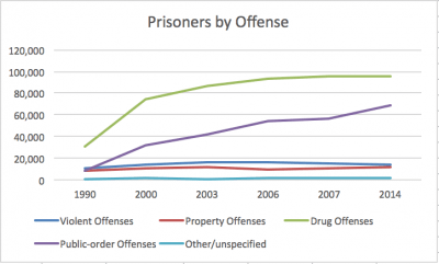
The following graph depicts the rise in the prison population by the offense. This graph depicts drug offenses a the most common and fastest growing reason that people go to prison. While property offenses, violent offenses, and other seem to have remained consistent over time, drug offenses as well a public order defenses have clearly risen. I am not surprised by what is shown about drug offenses due to the recent movement to decriminalize more minor drug offenses. This seems like it could be an effective way to decrease the overall prison population because drug offenses make up the greatest portion of prisoners in the system.

Poverty in America

After looking over the options that Professor Wang gave us for this blog, I was drawn to the topic of poverty. Many people will go to lengths to talk about poverty around the world, specifically Africa when it’s imperative that we look at our own country’s homeless and struggling Americans. Poverty USA is a website that informs its readers about the percentage of people in the United States who live in poverty. According to this website, in 2016 27.6% of Native Americans lived in poverty. Other ethnicity percentages of those who lived in poverty are as followed: 26.2% Black, 23.4% Hispanic, 12.4% White, 12.3% Asian. In order to make my chart, I rounded the number to the nearest digit so that it was easy to imagine how many people were homeless out of 100 people. We speak a lot in class about ways in which we can interpret numbers, and it is difficult to imagine a percentage of Americas population when there are millions of people who reside in the country. Below is my pie chart.


Introduction for Sustainability

Sustainability to me means successful problem solving in action. Since it can cover a variety of areas from economics to environmental conservation the problems that must be solved are endless. When someone fixes one of these issues for the better they are actively sustaining a better status for all and in the specific area. Growing up in a house hold with committed environmentalists has allowed me to see problem solving for sustainability first hand on numerous occasions. Some of the smallest examples seem to be direct fixes to the world’s largest of issues, like basic recycling or reducing your carbon footprint with better decision making on travel options. An issue that has always caught my attention with sustainability is that there seem to be a lot of people who think they are too little to make a change. That even if they recycled properly or carpooled to use less gas emissions that it would amount to a change worthwhile. It is one of the biggest issues I see with sustainability and seems to connect to many issues throughout the world today. I hope to explore the little things that are easy and will make a difference if we all just changed a habit or two for the better. Personally, I am a political science major who has taken classes and spent time in congress that have addressed actions taken to reverse and fix the effects of global warming. It has influenced me and my thoughts towards the environment directly driving me to enter this class and further my knowledge in the area.


I think that the article that you found is extremely interesting. That being said I would be curious to find a relatable article for your comments on CO2 levels and the corresponding physical damage to life on earth. I feel like many of us know that it is a major issue but do not understand what it directly is corresponding too. Possibly a good route for further investigation on this topic.


Your comments relating CO2 and photosynthesis needs for food and farming are extremely interesting. I wonder further however if there is a comparison between the photosynthesis CO2 produced and that of fossil fuels and artificial release. It could be a naive question but since it is a healthier production process is that different from the overall release of CO2 emissions.

Recycle!!!!!!!!!!!!!!!!!!!!!!

Recycling does not have an immediate and tangible outcome. Throwing a plastic bottle or plastic cutlery into the recycle does not reward one or a group instantly, so the lazy choice that many people make is to dispose trash wrongly. This though has a long and lasting detrimental effect on the world, when recycling waste properly will contribute to the slow, yet uprising state of our Earth yielding its longer existence.

In 2017, BBC news came out with an article titled “Seven charts that explain the plastic pollution problem” which publishes 7 different charts having to do with the increasingly horrendous amount of plastic trash in the world. Most of this trash exists now in our oceans. Two of these charts I have posted here.

According to this BBC article, 6.3 billions tonnes of plastic waste existed in 2015 while only 9% of it was recycled. About 80% ended up in landfills and 12% incinerated. In 2016, 480 billion plastic bottles were sold.


The first “Ocean plastic” chart illustrates which countries in the world are most responsible for plastic waste being Asian nationals amounting for 13 of the 20 nations most responsible. The US is within that group of 20 as well. About 10 million tonnes of plastic is estimated to exist in the ocean which kills aquatic life. This chart also shows the suction from where plastic waste is dragged into the water known as gyres which exist in 5 different place shown above.

This chart publicizes the amount of time specific waste takes to degrade. A styrofoam cup takes 50 years which is well within young adults lifetime today. Yet, every other garbage item will take between 200-600 years to biodegrade which will then release toxins into the environment. Recycle recycle recycle!!!!!!!!!!!!!