
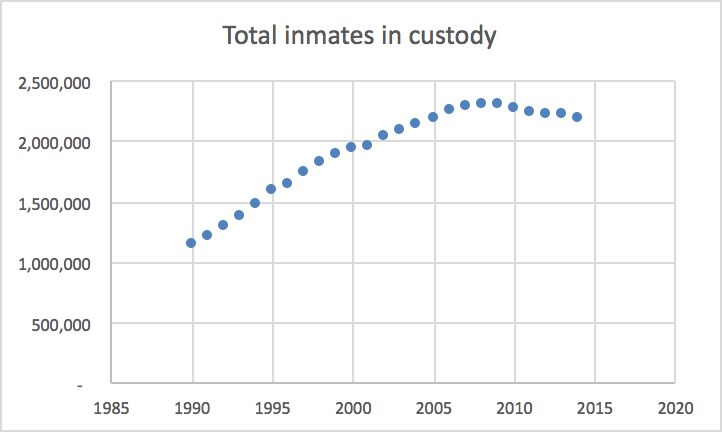
I chose to create two graphs that illustrate the growing prison population from 1990 to 2014. The issue of mass incarceration is extremely prevalent at the moment. One of the institutions of the United States which begs for significant reform is the criminal justice system. With the US being the countries with the most prisoners per capita, it is clear that efforts need to be made to reduce these numbers. I created the following graph depicting the overall rise in the prison population. You can see that the number of total inmates rises somewhat steadily from 1990 to about 2007 and then begins to level off approaching 2014. While it is positive that the population has stopped rising so quickly, it is important to make efforts towards decreasing the number of people in prison more rapidly as well.
The following graph depicts the rise in the prison population by the offense. This graph depicts drug offenses a the most common and fastest growing reason that people go to prison. While property offenses, violent offenses, and other seem to have remained consistent over time, drug offenses as well a public order defenses have clearly risen. I am not surprised by what is shown about drug offenses due to the recent movement to decriminalize more minor drug offenses. This seems like it could be an effective way to decrease the overall prison population because drug offenses make up the greatest portion of prisoners in the system.


Your graphs gave a different perspective to mass incarceration than I have been thinking about. I made a graph on the racial disparities of mass incarceration, but I am enlightened to see a post about the actual criminality behind the imprisonments. As you stated, I am also not surprised that offenders of drug related crimes have been on a steady increase since the 1990s. Perhaps by bringing more conversation and the decriminalization of marijuana, we will soon see a drop back down to lower drug crime rates.
These graphs are really interesting! Being able to visually see how each offense has changed throughout the years is eye opening. I am also not surprised that most offenses have remained steady throughout the years, with the exception of drug offenses. I am curious why total inmates in custody decreased around 2010.
I think your graphs make it really clear that there is a need for reforms to our criminal justice system. I think your second graph is really interesting in showing which criminal offenses are most prevalent. Your graph makes it clear that drug offenses are very much so the most common and there really is a need for more conversation around the criminalization of drugs.
I found your second graph incredibly interesting, specially with drug offenses contributing to a much greater number of prisoners than any other type of crime. I think this is especially problematic because I see that violent crimes is by comparison a very small amount of prisoners. With our current culture beginning to talk more and more about sexual assault, I would hope that something so serious as sexual assault would begin to be prosecuted more seriously than something like drug offenses.
I love your topic as I wrote about a similar idea showing the difference in drugs incarceration. The graphs are great as they show the offenses sending people to jail which tend to be nonviolent crimes. The poor population are they drug users but they are only seem due to over policing in the urban areas. Suburban areas are patrolled less and people have more freedom due to being in a different class level.