Human Population Growth Rate

World Population 1950-2100

During my research for this post, I found a graph on the world population and chose to implement the skills we’ve learned in class for this section. I decided to use the graph as my own new data to work off of. After gathering data from this graph, I found that in the 64 years between 1950 and 2014, the world’s population had increased by 4.76 billion people.

This computed out to be a 187.4% increase during the 64 year period (4.76 billion people [total change] / 2.54 billion people [initial] = 1.874). With this information, I went on to find the growth factor and rate of change.

2.54 billion people + 2.54 billion people x 1.874 = 2.54 billion people (1+1.874) = 2.54 billion people (2.287) = 7.3 billion people

After computing this solution, we can see that the growth factor was 2.287. To find the rate of change, I divided the total change (4.76 billion people) with the total amount of time (64 years), to find an increase of 74 million people per year.

Lastly, I have estimated that the growth of the world’s population between the years 1950 and 2014 was that of exponential growth, rather than linear. I found that the world’s population between 1950 and 2014 increased exponentially at around 1% per year.

 To find this, I made a table that looked something like this:

1950        1958        1966        1974

2.54         2.92         3.41            4        billion

_______________________

15%       16.78%      17.3%

380           490          590            million


Decline of Polar Bears

The Polar Bear population is declining and it is expected to continue declining in the future due to climate change. It is said that by 2050, the polar bear population could decline by 1/3. This is all due to the disappearing of arctic sea ice. The arctic sea ice is declining by a rate of 12% per decade since the 1970s. The melting of the ice and the warming of the waters is not a good climate for the polar bears because they are ice dependent. Much of the food they eat is primarily found in the arctic waters. Polar Bears rely on their access to seals as a sources of food and to breed.

Today, the population of polar bears is thought to be 26,000. By 2050, 8,580 Polar Bears will remain if this estimation remains true. That means that from 2018 to 2050 in this 32 year period the total change would be 17,420 polar bears. This means the decay factor is 0.33. Overall, something needs to be done to slow the decline of the polar bear population because right now they are at high rate of extinction. What is happening to polar bears is also happening to other species, so the issue of climate change needs to be addressed.


Growth of Uber

Uber is the top ride share app in the united states. Over the past few months Uber has been in the news for the effect they have been having on traffic in NYC. The saturation of drivers got to a point where the congestion and traffic was so heavy that Mayor Bill de Blasio put a cap on the growth of Uber drivers, potentially starting a trend in major cities (major markets) across the us. This graph is the exponential growth of drivers for Uber over there starting years.

It is important to notice that this growth is exponential and driven by customer demand. What will happen when the demand increases and Uber legally cannot support it. A lot is yet to be seen  and I am interested to see how their growth will continue.


Carbon Emission Intensity of Economies

Historically, economic growth has been linked to CO2 emissions.  Although countries who obtain differing levels of per capita CO2 emissions can still have similar gross domestic product per capita levels, these differences occur due to the differences in the CO2 intensities of these economies.  The article on Our World In Data explains that CO2 intensity measures the amount of CO2 emitted per unit of GDP. There are two key factors which affect the CO2 intensity of an economy; energy efficiency, and carbon efficiency.  Both factors simultaneously work together, because as efficiency improves in both energy and carbon usage, the CO2 emitted per unit of energy will fall.

The graph provided in the article shows CO2 intensity from 1990 to 2013 as a linear downward trend.  The CO2 intensity rates have been steadily falling since 1990. This can be considered a result of improved energy/technology efficiency, and increased capacity of renewables.

According to the graph, over the 23 year period between 1990 and 2013;

Total Change: -0.12kg

Decay Factor: (0.47kg/0.35kg)=0.74

Percentage change: (1-0.74)=.26= 26% decrease


Source: CO₂ and other Greenhouse Gas Emissions, Our World in Data 

Decline of honeybees

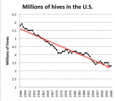
Bees have been endangered for decades now, and the chart above depicts just how much the number of bee hives in the Unites States has declined since the mid 1900s. What is still in question is the roots of the bee population problem. Some scientists are questioning whether global climate change has anything to do with the endangerment. The article I read talked about how much the bees were affected by this problem. “Climate change can influence consumer populations both directly, by affecting survival and reproduction, and indirectly, by altering resources. However, little is known about the relative importance of direct and indirect effects, particularly for species important to ecosystem functioning, like pollinators.” Although some research shows that it does in fact have to do with climate change, the direct foundations are still uncertain. Based on this chart, I decided to calculate a the percentage change to get a more accurate percentage on just how much the population of bees has changed.

The percent change from 2000 to 2006 is about 6%.

Linear Global Population Growth

The article I looked at claims that despite popular opinion, the global population is not growing exponentially, but rather is growing in a straight line. Exponential growth is described as the growth rate of the population, as a fraction of the population’s size, and is constant. Therefore, if a population has a growth rate of 2%, and it remains 2% as the population gets bigger, it’s growing exponentially. Despite the starting points of two quantities, the one quantity that grows exponentially will become larger than one growing linearly. For the United States, the population growth over the past half century has been very close to a straight line, the R2 is 0.9956.

Essentially, it seems as if people confuse the words exponentially and increasingly when talking about population growth. The graph shown demonstrates linear growth, and how exponential growth occurs only when the percentage growth rate remains constant as the population gets bigger.

Fertility Rates Throughout the One Child Policy

Is it weird to think that a country could introduce a policy that limits the amount of children a family is allowed to have? I think it is a bit odd, but I do understand the reasoning behind it. Throughout the middle of the 20th century, China’s population rapidly increased. From 1960-1975 the each woman on average gave birth to 5 children. But then, in 1979 the One Child Policy was introduced to help control the population.

This strategy worked in population control, but not with gender demographics. Because, many families still work on farms, they decide to keep the male babies and put their female babies up for adoption. This resulted in a ratio of for every 120 men, there are 100 women. This ratio then suggests that by the year 2030, there will be over quintuple the amount of males who have never married. Since this policy has been implemented and then edited, now each woman on average has 1 to 2 children.

Lets break this down,

In 1960, the fertility rate was 5.75 children per woman

In 2018,: 1.64 children per woman

Decay rate: 1.65 children / 5.75 children = .285

Percent change 1-.285 = .715 = 71.5%

–>  this suggests that there is a 71.5% decay rate of fertility per woman throughout the time in which the One Child Policy was applied.

I find it interesting that the government is controlling how many children each family is a allowed to have. As a child of the One Child Policy, I support the idea of why it the policy was applied, but it does not surprise me that there are more males and females and now the countries is concern is reproduction.

Growth and Decay, Population Change

Growth and decay refer to the direction in which a quantity is changing. If something is growing, it means that a value is increasing (example–world population growth over time). If something is decaying, it means that a value is decreasing (example–population of Japan is decaying over time). A growth or decay factor describes the rate at which a quantity is changing over a certain period of time via a multiplication sequence (factor implies multiplication). For example, to describe a population increase by 10%, multiply by the growth factor 1.10. To describe a population decrease by 10%, multiply by 0.90 (shows a 10% decrease because only 90% of the theoretical population is remaining. A total change is the amount by which a quantity increases or decreases–for example, the total population change for Japan from 2010 to 2016 was a population decrease by 1.13 million (128.06 million in 2010 –> 126.93 million in 2016). The percent change for this population from 2010-2016 would be a 0.88% decrease in population. The average rate of change would be decreasing by .18 million people per year (this means the population is decreasing by less than a quarter of a million people per year). The terms linear growth would refer to a steady decrease per year, resulting in a linear graph while exponential growth or decay means that a quantity is increasing more and more rapidly or decreasing more and more rapidly over time.

See the data for Japan population decay here.

Home Owners and the Decline of the American Dream

It’s safe to say that the American Dream is still around in a pretty prominent way; however, is the American Dream and all it’s trimmings becoming obsolete? One of the key pillars of that famously patriotic dream was the idea of owning a home with a mortgage somewhere out in the suburbs. However, the recent years following the real estate bubble and the 2008 recession have shown a decrease and stagnation in home ownership across the country which could lead to the idea that the American Dream may stop being relevant.

There are massive amounts of articles discussing this problem in America, but the general consensus seems to be that there are five major reasons for the stagnation/decline of homeownership after the housing bubble and 2008 recession all outlined in an article for US News. The first is the lack of mortgage availability due to the credit shortage following the recession, which led to the decline in loan approval even with excellent credit. The second, an issue incredibly relevant to out generation, is the dramatic increase of student debt among younger generations and the rising prices of higher education which leads to the lack of saving for the future goals of owning a home. The third has to do with a more psychological aspect of s term coined “post-foreclosure stress disorder”, essentially meaning that families and individuals whom had their homes foreclosed upon during the recession could be more hesitant to take the risk on homeownership once again. The fourth and fifth reasons appear to be the issues of housing supply and affordability, and the supply is minimal while the affordability for first time home owners isn’t affordable at all.

The following data for homeownership was collected from the US Census Bureau’s website. Sorry it’s a download, my computer wouldn’t let me insert the excel sheet into the post.

chart hw week 4-ql76xt


Wage gap between immigrants and U.S.-born citizens

Immigration has been an increasingly covered issue in the media in the last few years. Many americans fear that immigrants are “taking the jobs from american-born citizens.” However, this article in Forbes shows the wage-gap between US-born and immigrant americans. The discrepancies in pay between these two groups is in the thousands in over 29 states. This graph below shows the ten states with the highest wage-gap differences between immigrants and US-born citizens.

According to this graph, the top of the list is an almost $20,000 difference in the annual income of these two groups. The US-born citizens had a median annual income of $59,689 while the immigrants earned $40,145. The article also mentions that immigrants make less money than U.S.-born citizens in 45 states. So although some americans may fear that immigrants are taking opportunities from U.S.-born citizens, this data shows that U.S.-born citizens are, at the end of the day,  making more money annually than immigrants.