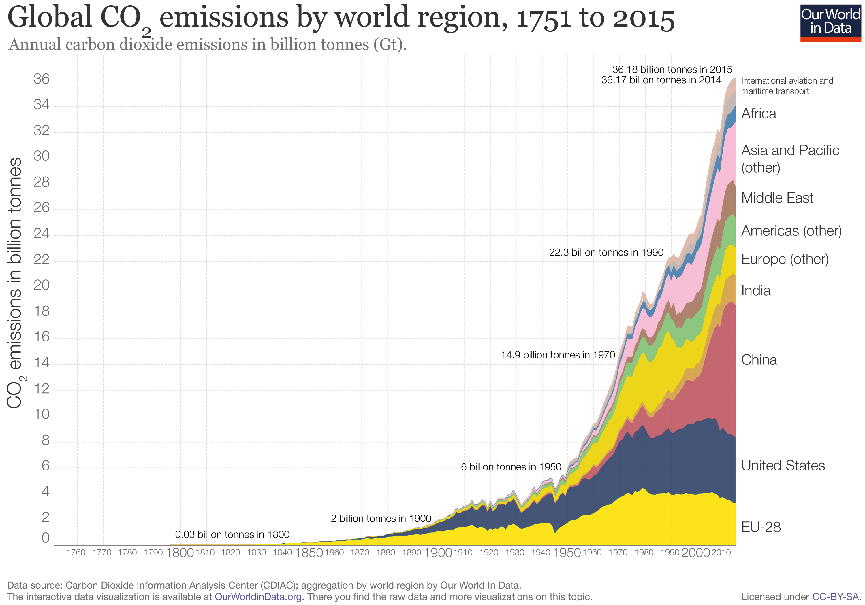
The website “Our world in data” specializes in gathering data, assessing it, and presenting it effectively through graphs. Looking purely at numbers and trying to distill a trend or message from them is often quite difficult. I think this website does an effective job of presenting important world data in an interesting manner. The specific article I found the graph on is titled “CO2 and other Greenhouse Gas Emissions,” by Hannah Ritchie and Max Roser. They elaborate on the role CO2 plays in our atmosphere (its processes and interactions with plants and humans) and give close to 30 graphs that show various statistics. Levels of methane, nitrous oxide, are shown, along with representations of various GHG outputs by country. All the graphs are interactive, and you are able to click on them to learn more.
The graph I chose to present deals with the global CO2 levels worldwide in recent history. A line graph of sorts, it breaks down global CO2 emissions, but distinguishes each countries output by color. The graph starts in the year 1751, so its interesting to see how little CO2 was emitted early on compared to now. Industrialization and the rise of the world’s population are obviously the largest factors in play here with this trend. However, even from 1990 to 2015, there was a significant jump, where CO2 emissions almost doubled. In looking at the division of countries by color, one can see that the U.S. and China make up the bulk of world emissions. China has slightly larger emissions than the U.S. currently. I think it’s interesting to see that no other singular country comes close to the U.S. or China in terms of emissions.


