
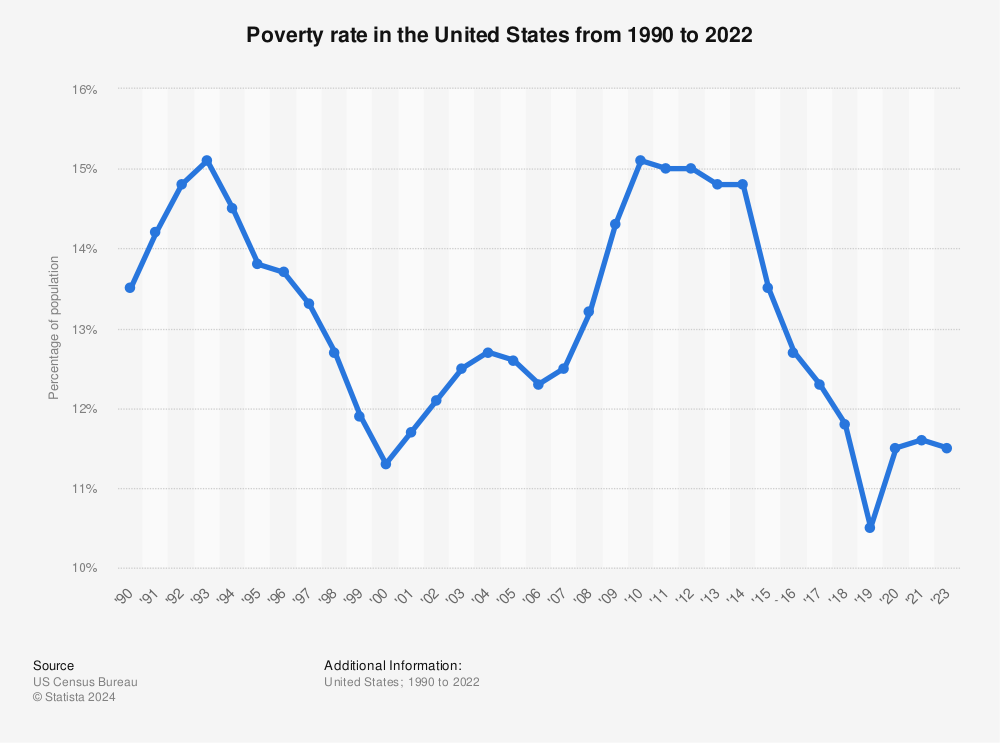
I found this graph to be very interesting. Illustrating the poverty rate in the United States since 1990, there seems to have been a few high points and low points that correlate with various economic depressions or surpluses. As much as these numbers may spike and drop significantly, the poverty rate in the United States never deviates greater than 4% in the last 28 years. In addition, it should be noted that the lowest and highest levels of poverty existed in 2000 and 1993. Following the surplus left by President Bill Clinton, the country saw a dip in unemployment down to 11.3% percent. After a steady rise following 9/11 however, the unemployment rate sky rockets to just over 15% when the economic recession of 2008 hits. For most of President Barack Obama’s second term, these numbers remained pretty consistent. From the end of 2014, to present day our poverty rate nationwide has been dropping pretty consistently and at quicker margins. I would like to point out however, that these graph only focuses on the overall poverty statistics. As it is, the U.S. Census Bureau states that African Americans make up over 20% of impoverished people throughout the United States. So despite these poverty rates decreasing overall, I would be interested to see a more thorough break down of poverty rates by demographic as well as races within that demographic, in order to see if these graphs and statistics are truly accurate and not misleading.

I was very interested about your analysis of the poverty rates in America throughout the years, however, I too would be very interested in seeing a further breakdown of how much different demographics make up this percentage today.
I found your graph and comments on the presidential changes and there corresponding changes with the economy and unemployment rate to be very interesting. This same theme that presidents can have a great impact on sustainability was seen in our class taught by Alexander Lykins when he addressed the change in CO2 levels had a great change following Obama taking office. I feel like this influence from leaders is going to be a theme we see a lot throughout the class.
I found your graph to be very telling, and your blog to be very interesting. I agree with your point about wanting to dive deeper into the demographics behind the poverty. The graph is very general, and I would be really interested to see the breakdown.