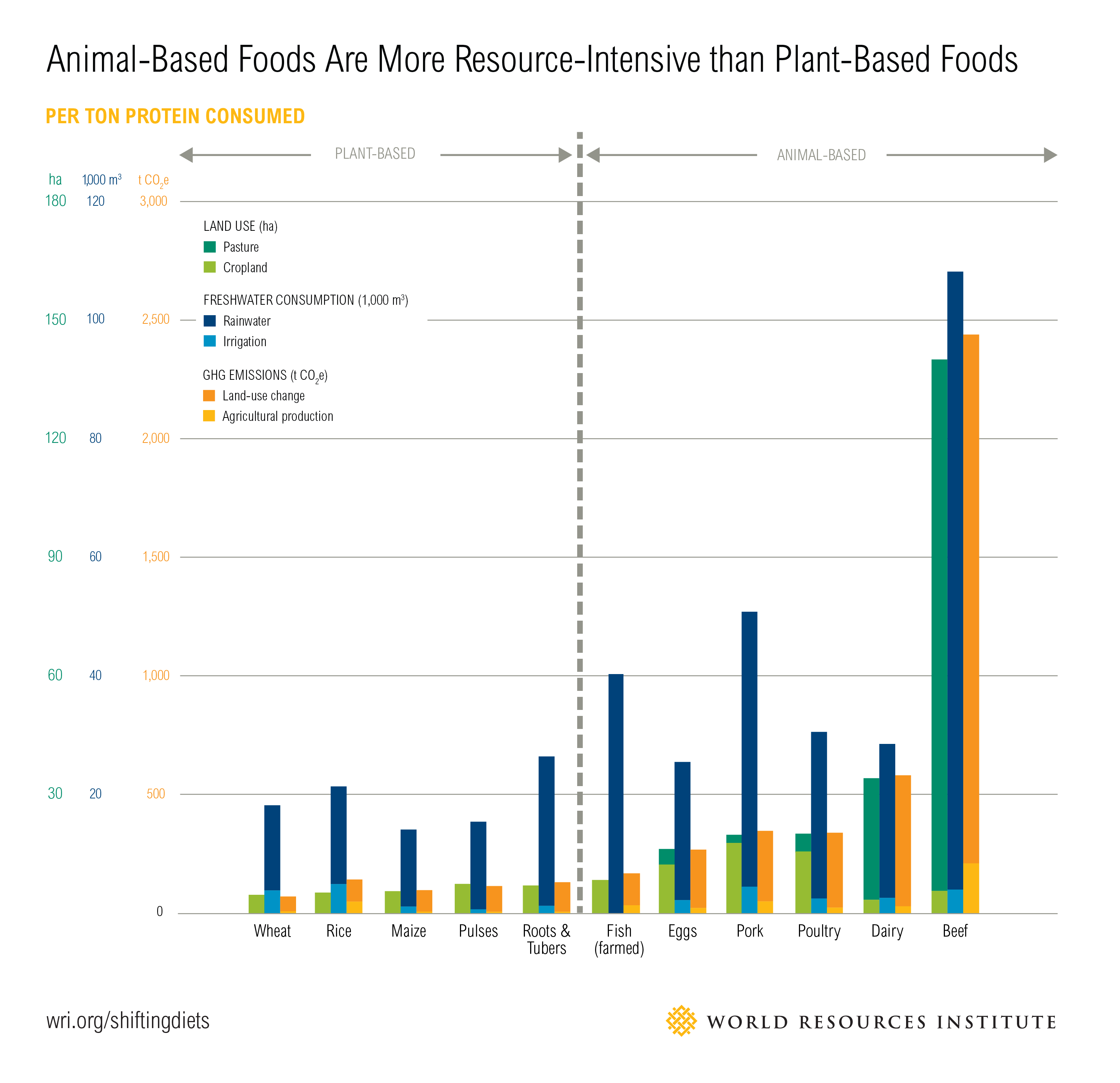
The production of animal based foods is an issue we have been discussing in class for the past few weeks and this chart helps break down consumption of meats and vegetables. The chart shows the required land, water consumption, and GHG Emissions for produces like wheat, rice, eggs, pork, and beef. The charts are higher when it comes to the consumption of meat as it takes more resource to cultivate. Producing animal-based foods is responsible for more than three-quarters agricultural land use around the world. The amount of land it takes to raise cattle is neisse compared to the land needed for agriculture. The resources that would be used on agriculture would not only be cheaper but have more benefit for everyone. Agriculture’s production-related greenhouse gas emissions is less compared to that of meat related consumption because of waste in resources. Because many animal-based foods rely on crops for feed, increased demand for animal-based foods widens the food gap relative to increased demand for plant-based foods.
Monthly Archives: September 2018
Investing in the Future
If how our society acts right now is how the future is going to be, its going to be a long road ahead to recovery. If we were to reduce our emissions by investing in nature then we would be promoting more sustainable options for a successful environment. Reducing fertiliser use and protecting wetlands from development are just a couple goals for sustainability in the future. There have been cases of finding and creating sustainable alternatives to current struggles we’re encountering as a society. For example in the realm of Co2 emissions, the following graph is a great representation of what has happened to date and what is actually the best way to approach the consistent worldwide epidemic of Co2 overuse.
If we were able to become more sustainable in Co2 emission, especially in the regions of South America and South East Asia then we could save the world from the years of future damage due to global climate change.
A Meat-Free Diet Can Save the Planet
Our planet is getting to a point where we need to start taking matters into our own hands in terms of climate change. We can no longer rely on government figures or political action…it’s time we make positive adjustments on our own. We are no longer a part of the climate accord of Paris, people are advocating for certain sustainability policies that are going to be tough to get passed, and there is just not enough productivity to reverse the negative environmental effects we have had on our home.
Right now, it is estimated that 30% of the planet’s landmass is set aside for factory farms, a.k.a. for meat, dairy, and egg production. According to the UN, “Livestock production causes an even larger contribution to climate change than the transportation sector worldwide..” It seems shocking, but the numbers add up. Factory farmed animals are a much larger contributor to climate change than all the world’s cars, trucks, trains, planes, and ships combined.
So what can we do about this? Reduce the amount of animal-based foods that we consume. The graph below depicts the amount CO2-equivalent emissions produced when making a half pound of both animal products and vegan products. It is unquestionable that the plant-based foods produce a significantly less amount of CO2 than the animal-based foods. Just imagine if you cut out animal products from your diet just for 3 days a week. The amount that your personal carbon footprint would decrease would be staggering.
We clearly do not need to rely on politicians and activist to make a change in the condition of this planet. We need to take matters into our own hands and start by making the conscious decision of what we put onto our plates each and every day.
Where Our Garbage Goes
The graph I looked at shows discarded materials by the millionth ton from the years 1960-2005. I found it very interesting and alarming that so much of our discarded materials are merely just thrown into landfills, along with the fact that only recently we as a society started converting our waste into energy and composting as well.
As a nation, we are slowly becoming more sustainable, but we must continue working to fix our problems and find new ways to convert waste into clean energy. Another graph that I looked at is landfill waste in the European Union in 2005 (Netherlands, Sweden, Denmark, France, Italy, Germany, Spain, the UK, Bulgaria, and Ireland). The waste was measured in kilograms per person.
I found this graph very interesting to see Ireland was leading the way in waste per person and the average for the EU was surprisingly high. Although the statistics are over ten years old, it’s surprising to see how high some countries landfill waste was. As humans, we should continuously work towards getting away from landfill usage and utilizing our waste for energy. At this pace, we will not be able to properly discard any of our materials, because landfills will be overwhelmingly large and our ozone will continue to deteriorate.
Recycle!!!!!!!!!!!!!!!!!!!!!!
Recycling does not have an immediate and tangible outcome. Throwing a plastic bottle or plastic cutlery into the recycle does not reward one or a group instantly, so the lazy choice that many people make is to dispose trash wrongly. This though has a long and lasting detrimental effect on the world, when recycling waste properly will contribute to the slow, yet uprising state of our Earth yielding its longer existence.
In 2017, BBC news came out with an article titled “Seven charts that explain the plastic pollution problem” which publishes 7 different charts having to do with the increasingly horrendous amount of plastic trash in the world. Most of this trash exists now in our oceans. Two of these charts I have posted here.
According to this BBC article, 6.3 billions tonnes of plastic waste existed in 2015 while only 9% of it was recycled. About 80% ended up in landfills and 12% incinerated. In 2016, 480 billion plastic bottles were sold.
The first “Ocean plastic” chart illustrates which countries in the world are most responsible for plastic waste being Asian nationals amounting for 13 of the 20 nations most responsible. The US is within that group of 20 as well. About 10 million tonnes of plastic is estimated to exist in the ocean which kills aquatic life. This chart also shows the suction from where plastic waste is dragged into the water known as gyres which exist in 5 different place shown above.
This chart publicizes the amount of time specific waste takes to degrade. A styrofoam cup takes 50 years which is well within young adults lifetime today. Yet, every other garbage item will take between 200-600 years to biodegrade which will then release toxins into the environment. Recycle recycle recycle!!!!!!!!!!!!!
Where does our plastic trash go?
Clearly, plastic contributes to a large portion of the humans waste that pollutes the environment. Although we are told to reduce, reuse, and recycle, much of our plastic is disposed of improperly and ends up in places where it has the potential to cause great harm, such as the ocean.
The graph I chose details the portion of plastic trash that is disposed of improperly as well as the portion of that plastic that ends up in the ocean. In 201o, 275 million tonnes of plastic trash was produced. Of this 275 million tonnes of total plastic waste, 31.9 million tonnes were disposed of improperly and, therefore, 243.1 million tonnes were disposed of properly. Although at face value it seems like this means we’re doing pretty well with recycling, when I calculated the percentage I discovered that this means 11.6% was disposed of improperly and 88.4% was disposed of properly. This means more than 1 in 10 articles of plastic waste were not recycled, which gives these stats perspective and shows that we are really slacking on recycling. Additionally, of the 31.9 million tonnes of improperly disposed plastic waste, 8.75 million tonnes ended up in the ocean, which is 27.4% of the improperly disposed of plastic and 3.2 percent of all plastic waste.
By further interpreting graphs such as this one, it is possible to gain a more comprehensive perspective on the real meaning behind the numbers and what they really mean.
Population Growth and Sustainability
For my data selection, I chose to examine world population graphs. Below, we see the graph of the changing population from 1750 to the projected population in year 2100. The red line that we see in this graph shows the annual growth rate of the world population. This line expresses how growth was relatively between .4%-.6% from 1750 up through 1930, but after the baby boom post WWII, population growth shot up exponentially. Now, with less people having babies and the population is unable to replenish itself, population growth is now slowing at an exponential rate as well. There are several reasons for this–more women are joining the work force and are either waiting to have kids, having less kids, or not having kids at all. Some women choose not to have children at all due to their perception of the world in its current state, which is something I learned from my political science class this past spring. The other curve seen on this graph is the blue curve of the world population. The dark blue shaded in section represents the actual population growth from 1750 up to 2015. The lighter blue shaded in region represents the projected population growth from 2015 up to the year 2100. The population is still increasing, but at a much slower rate than in the past, which is why the slope of the projected population growth is much less steep than the slope of population growth from 1945 to 2015. This relates to sustainability because our current population growth is not sustainable for our Earth. This is partially due to the amount of food we need to grow to feed this giant population, and the amount of land that we need but do not have to efficiently grow food on (not all land is good for growing crops). This also relates to my research from last week discussing the problems with eating meat, as this population size is not sustainable for having humans be able to consume meat (which the practice of raising the meat in itself isn’t sustainable as well).
Link to article here.
Sustainability of Crops
Despite the attempt to increase the productivity of crops through modern agricultural techniques, a recent study found that crop yield has not been rising at a sufficient pace to meet the projected demand by 2050. The study analyzes the historical improvements in crop yields for corn, rice, wheat and soybeans. The solid lines in the graph below show that growth has been growing at a consistent rate over that past few years. However, they also show what would happen if this growth rate continues, which is a rate that is unsustainable. The dashed lines show how productivity would need to grow even more rapidly in order to satisfy the expected demand in 2050, essentially doubling global food production.
This additional wheat production graph below shows that crop productivity is not the same across the world and is actually stagnating. In the U.S. Midwest, wheat yields per acre have been rising at a 2 percent per year. But in parts of India or Eastern Europe, they’ve basically flat-lined. It is assumed that the countries experiencing this are simply not using their resources such as fertilizers properly. However, on the other hand, some parts of the world are hitting a “biological wall,” a limit on how much yields can keep rising. Even with genetic modification and better technology, there are physiological limits for plants. This in combination with the effects of global warming such as extreme heat waves that can affect crop yield are quite terrifying when considering our future. The current population of about 7 billion is projected to rise to 9.6 billion in 2050 suggesting that our crop yields will not be sustainable. Essentially, we are not growing enough to feed the world.
The Frequency of Natural Disasters
Certain areas across the United States have been targeted most by natural disasters. For example, In the last 16 years, Louisiana has seen 6 hurricanes. Additionally, California has become more prone to wildfires. The graph below shows the annual losses in billion dollars each year since 1980. It is clear that in the last 40 years, the amount of billion dollar disasters has increased, significantly. It is also clear that these disasters have become much more frequent. In the first 3 months of 2018, 3 big storms hit. One of the three was Hurricane Harvey with damages that cost $125 billion which was right up there with the costs of Hurricane Katrina in 2006. The graph below also shows that while 2018 has been the most costly year so far in terms of natural disasters. The overall costs of natural disasters has increased significantly since 1980.
Graph of Global CO2 Emissions
The website “Our world in data” specializes in gathering data, assessing it, and presenting it effectively through graphs. Looking purely at numbers and trying to distill a trend or message from them is often quite difficult. I think this website does an effective job of presenting important world data in an interesting manner. The specific article I found the graph on is titled “CO2 and other Greenhouse Gas Emissions,” by Hannah Ritchie and Max Roser. They elaborate on the role CO2 plays in our atmosphere (its processes and interactions with plants and humans) and give close to 30 graphs that show various statistics. Levels of methane, nitrous oxide, are shown, along with representations of various GHG outputs by country. All the graphs are interactive, and you are able to click on them to learn more.
The graph I chose to present deals with the global CO2 levels worldwide in recent history. A line graph of sorts, it breaks down global CO2 emissions, but distinguishes each countries output by color. The graph starts in the year 1751, so its interesting to see how little CO2 was emitted early on compared to now. Industrialization and the rise of the world’s population are obviously the largest factors in play here with this trend. However, even from 1990 to 2015, there was a significant jump, where CO2 emissions almost doubled. In looking at the division of countries by color, one can see that the U.S. and China make up the bulk of world emissions. China has slightly larger emissions than the U.S. currently. I think it’s interesting to see that no other singular country comes close to the U.S. or China in terms of emissions.