Graph of Global CO2 Emissions

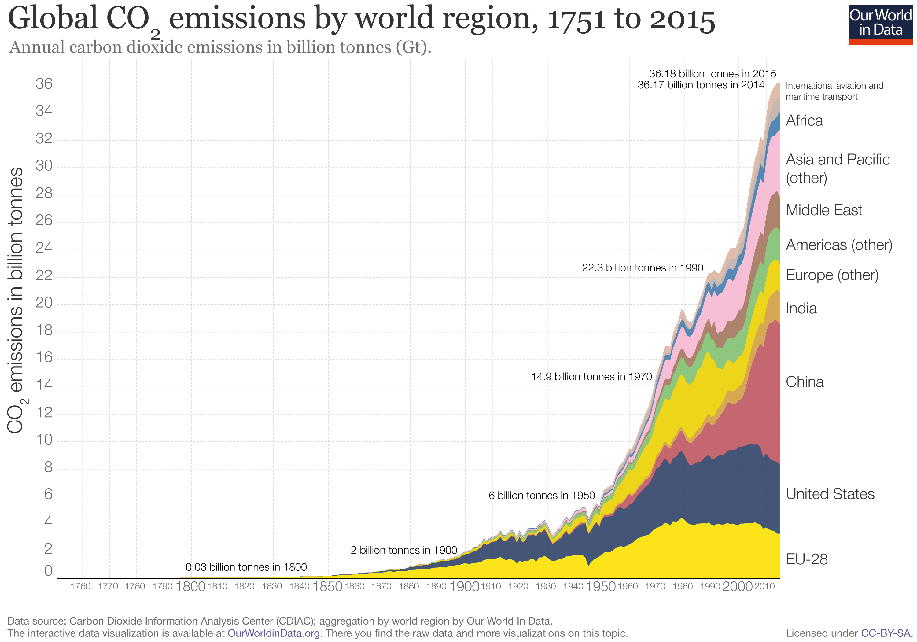
The website “Our world in data” specializes in gathering data, assessing it, and presenting it effectively through graphs.  Looking purely at numbers and trying to distill a trend or message from them is often quite difficult.  I think this website does an effective job of presenting important world data in an interesting manner.  The specific article I found the graph on is titled “CO2 and other Greenhouse Gas Emissions,” by Hannah Ritchie and Max Roser.  They elaborate on the role CO2 plays in our atmosphere (its processes and interactions with plants and humans) and give close to 30 graphs that show various statistics.  Levels of methane, nitrous oxide, are shown, along with representations of various GHG outputs by country.  All the graphs are interactive, and you are able to click on them to learn more.

The graph I chose to present deals with the global CO2 levels worldwide in recent history.  A line graph of sorts, it breaks down global CO2 emissions, but distinguishes each countries output by color.  The graph starts in the year 1751, so its interesting to see how little CO2 was emitted early on compared to now.  Industrialization and the rise of the world’s population are obviously the largest factors in play here with this trend.  However, even from 1990 to 2015, there was a significant jump, where CO2 emissions almost doubled.  In looking at the division of countries by color, one can see that the U.S. and China make up the bulk of world emissions.  China has slightly larger emissions than the U.S. currently.  I think it’s interesting to see that no other singular country comes close to the U.S. or China in terms of emissions.


Image result for countries that emit the most waste graphs

Poor Plastic Management

The graph above shows us the “The Top 20 Countries with the Worst Plastic Waste Management” in the world which are in order of most to least “plastic waste with poor waste management*”…

  1. China
  2. Indonesia
  3. The Philippines
  4. Vietnam
  5. Sri Lanka
  6. Thailand
  7. Egypt
  8. Malaysia
  9. Bangladesh
  10. South Africa
  11. India
  12. Algeria
  13. Nigeria
  14. Turkey
  15. Pakistan
  16. Brazil
  17. Myanmar
  18. Morocco
  19. North Korea
  20. USA

When this graph talks about how plastic waste in improperly managed the authors are referring to the millions of metric tons that end up in the ocean every year. This bar graph in particular recognizes that even though “North America, China, and Europe  produce around two-thirds of the world’s plastic” it is not reflected in this graph because it is managed more “responsibly”.

Although, on further research I found that the United States is dependent on China’s plastic waste footprint economically as we import over 20% of our goods from China. It makes me question these graphs and how accurate they really are when we are so interconnected to one another in an age of hyper-globalization. It’s hard to know who to point the finger at when it comes to poor plastic management which is why it’s probably just best to look in the mirror.


Start Carpooling to Work

According to Pew Research Center, Americans are making few eco-friendly and sustainable lifestyle choices, even though three-quarters of the population see climate change as a very serious issue. The Environmental Protection Agency strongly recommends that people purchase an electric car, instead of one that runs on gas. However, 95% of Americans have not made this switch. The EPA also suggests that people carpool or use public transportation to commute to work, but three quarters of Americans still drive alone.

The graph below shows 7 different modes of transportation that people use to commute to and from work and how the popularity of each has changed since 1980. Since 1980, “driving alone” has increased from 64.4% to 76.5%. The number of people who carpool to work has decreased by more than half from 19.7% in 1980 to 9.2% in 2014. In general, people are also using less public transportation and taxis, but there is an increase in the number of people who work from home.

Even though the EPA has made recommendations as to how people can live more sustainably and 45% of the population has said that climate change is a huge threat, few people are actually making any changes to their routine. What do you think are other ways that would get people to actually make more sustainable choices?   

Sustainable Waste

The Atlas of Sustainability publishes data from around the world about environmental sustainability. Above is a chart of the top 10 countries with the most municipal waste, how much waste is collected, and where that waste goes. The United States is responsible for the most total waste collected, totaling over 200 million metric tons of municipal waste. Out of the waste collected in the United States, over 50% (52.7%), more than 100 million metric tons, ends up in landfills in the year 2014. 12.8% of waste in the United States was incinerated. In the year 2014, only 25.7% of waste was recycled in the United States, and only 8.7% of waste was composted.

When waste ends up incinerated or in landfills, it can have negative environmental impacts. Landfill waste is responsible for greenhouse gas emissions of both carbon dioxide and methane. When waste is burned, these greenhouse gases are also emitted into the air. In addition to air pollution, landfills also account for groundwater pollution. When it rains, hazardous chemicals dissolve and collect at the bottom of landfills. These chemicals dissolve into the ground, polluting the ground and soil.

When we recycle, we save waste from ending up in these landfill facilities and are able combat environmental damage. In order to reduce our negative environmental impact, Americans should make an increased effort to dispose of their lifestyle waste through recycling or composting. This way of disposal is far more environmentally friendly, and not very difficult to practice.

U.S Consumption of Beef

Since posting last week about the water footprint of beef, I have not been able to get it off my mind. I took this week’s post as an opportunity to go a bit more in depth about the consumption of beef in the United States. An article I found discusses the shift of Americans from beef toward chicken consumption.

The graph shown below displays the peak of beef consumption in America during the 1970s, through the current decline of beef consumption per capita. During this 17 percent decline of beef consumption, greenhouse gas emissions decreased by 10%. As we can see, pork and poultry consumption have relatively stayed the same throughout this period of time. Though this means more chickens are being eaten, reducing the amount of beef consumed proves crucial to reducing our carbon and water footprint.

The article goes on to explain that the production of beef emits seven times the amount of greenhouse gases than chicken. Further, the carbon and water footprint of beef is roughly 20 times that of plant-based foods like beans.

The next graph shows that the production of chicken has increased by 5 times, while beef production has stayed consistent. This is partly due to the high demand for cheaper meats like ready to cook chicken. Beef takes longer to cook, making chicken an easier everyday option for most Americans.

Lastly, we should touch on America’s dietary footprint. Though we have decreased our consumption, beef still accounts for almost half of our dietary footprint. The final graph shows that American consumption of beef is not only one of the highest in the world, but actually four times the world average.

These trends all point to one thing: reducing our production and intake of beef will substantially decrease our carbon footprint within a single generation.

Sustainable Transportation

In his article, The World’s Top Cities for Sustainable Transport,  Niall McCarthy discusses the research behind the graph below, which identifies cities across the globe that have the most sustainable public transport in 2017. Hong Kong has been rank number one for sustainable transport. I wouldn’t have guessed that one of the most populated cities in the world would be able to maintain such a sustainable transportation system simply due to the mass amounts of people circulating around the city each day.

Surprisingly enough, two other asian cities are also in the top-10. Due to the 23 different indicators that were involved in the ranking, some cities scored well in urban mobility. The article also notes that the top U.S. city is actually New York City! Ranking 23 overall, New York scored really well for its subway system, train connections to Long Island and New Jersey, and wheel chair accessibility. Although it’s not on the graph below, New York scored very well in comparison to other major cities in the U.S..


Graph is based on data taken from 100 major cities across 23 different factors to rank the transportation services.

Unilever’s Sustainability Report

The huge corporation, Unilever, whose company mission statement states, “We meet everyday needs for nutrition, hygiene and personal car with brands that help people feel good, look good and get more out of life” started a sustainability campaign in 2010 due to increased distaste from the public with regard to Unilever products.  Every year the company conducts a “Sustainable Living Plan” progress report and in the first year of the campaign the company’s greenhouse gas intensity fell 16% from 118.31 to 99.97 kg per metric ton of production, as seen in the pie chart.  According to this chart which was included in the progress report the highest amount of greenhouse gas emission comes from customer use of soaps, shampoos and shower gels.  As of 2018 the company has set a target to double its business while halving the environmental footprint of its products across the value chain, and sourcing 100% of agricultural raw materials sustainably, all by 2020.  This goal was set in 2010 so the 2020 goal seemed lightyears away but with 2020 right around the corner, data analysts have criticized Unilever for not providing the whole picture with regard to their sustainability progress.  Specifically in the 2011-2012 progress report there was no data to back up this chart, there was only the chart.  On the Unilever website, the company claims that that it is on-plan for every individual sustainable sourcing target thus far.  I suppose we’ll find out in two years.

American Isn’t the Biggest Problem

In this article, it is discussed how many different countries, other than America, are found to be incredible dangerous when it comes to littering and keep trash off of the streets and oceans. When people tend to think of Global Warming and littering issues, they tend to only think of what they can do in their own country, and for the most part, this seems to be talked about in America.

I think an important part of this process, if we as humans are really trying to make a difference on our environment, would be to educate other countries about the dangerous of littering as well. As shown in the chart taken from this article, other countries such as China and Indonesia are struggling immensely when it comes to trash issues.

I would argue that we are not actually making an impact on the environment as a whole if we do not take a step back and make sure we are educating the whole world, not just our country. 

Plastic is the Problem

The article I analyzed, entitled, Seven charts that explain the plastic pollution problem, by BBC News explains how plastic consumption, not only in the United States, but across the globe have a series of severe impacts on our environment, and maintain there for a plethora of years.

The article first explains the amount of plastic that have been produced to date of the article (December 2017). It has been recorded that 8.3bn tonnes of plastic had been produced, and as of 2015, only 9% was recycled, 12% was incinerated, and 79% was accumulated in landfills or in the natural environment. This vast amount of waste should not be extremely surprising, considering plastic products are usually ‘throwaway’ or ‘single use’ items.

Later in the article, it explains the amount of plastic that ends up in the sea. The article estimates that about 10m tonnes of plastic makes its way into the oceans annually. A study published by the National Center for Ecological Analysis and Synthesis and the University of Georgia in Athens conducted a survey which found that Asian nations were 13 of the 20 largest contributors to plastic waste in the oceans. Although the US was not the biggest contributor, we were still ranked in the top 20, meaning that we are not off the hook for ocean contamination.

The most interesting graph I found was a bar graph that estimates how long certain plastic products take to biodegrade. The graph shows that it takes 50 years for a Styrofoam cup to degrade. This basically means that everyday your morning coffee cup will stay in the environment for about half a century.


Source: Seven charts that explain the plastic pollution problem

The Social Safety Net is Not Sustainable

The Social Security Administration was created in 1935, as part of the New Deal legislation enacted by the Roosevelt Administration. The idea was this: create a social safety net wherein older workers could retire from the workforce without the risk of going broke, and in the process create additional job openings for the unemployed masses of the Great Depression.

If it seems to you like a brilliant idea, in more ways than one, that’s because it was. It was absolute political genius.

But there was a catch.

Finding a way to pay for it.

So the government, in its infinite wisdom, kicked the proverbial can down the road. They used the present workforce to bankroll the retirement of the one about to retire. Here’s how it worked:

I receive a weekly or monthly paycheck. A portion of that paycheck, though small and almost unnoticeable, is already deducted. This is the FICA (Federal Insurance Contributions Act), or Social Security, tax. In a perfect world, the money that gets deducted from my paycheck is kept for me in government coffers until the day I retire. From that point on, I start to receive my Social Security benefits, paid for by, you guessed it, all the money I paid into the system over the years I worked.

Yet, when the system began, there were too many retirement-eligible workers who had paid nothing into the system. In order for them to receive benefits, someone had to foot the bill. Which is where the present workforce came in. The present workforce paid for the benefits of the workforce that retired before them, and the workforce which follows them pays for them. It should be, in theory, a self-sustaining system. You pay for the people who came before you, and the people who come after pay for you. That is so long as each successive generation isn’t exponentially larger than the one which follows it.

Here’s where the problem arises. The United States had, after winning World War II and in the period from 1946-1964, the Baby Boom. America produced the most populous generation of Americans in history. And now, some 54-72 years later, the present generation has to foot the bill as the Baby Boom generation leaves the workforce and enters into retirement. The problem is that the present generation is not populous enough to pay for the generation which preceded it.

There simply aren’t enough of us, and enough of our parents, to pay for the Baby Boomer retirement. It’s an unsustainable system. As the graph above demonstrates, the Social Security Administration has begun running a yearly deficit. It is paying out more in retirement benefits than it collects through tax from the present workforce. If the system goes without reform, which given the current state of American politics is entirely plausible for the foreseeable future, it will add tremendous debt to a federal budget and government already prone to deficits and debt. One unsustainable system is fueling the unsustainable nature of another.

For decades, Social Security has been called the “third rail” of American politics. That’s because it’s where all the power is, if you know how to harness it. If not, if it goes wrong, it can turn deadly. Fast.